From donuts and chocolate to museums, non-profits, resorts, and even a philharmonic — these are the best of the best from this year’s Logo Design Awards!
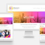
Congrats to the 10th Annual HOW Logo Design Award Winners!
The HOW Logo Design Awards recognize the best of the very best when it comes to great logo design. A logo is one of the most important aspects of any business, and the team at HOW looks forward to the entries we receive from you each year because, well, we are design geeks (as you know) but because seeing the fantastic logos you’ve created shows us where brands are coming from in terms of values and aesthetics — and where they are headed with the designs you’ve created for them!
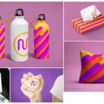
As significant as the design of the logo is, the application of the logo is equally pivotal. That’s why we have our Identity Applications category, which allows you to show off anything created in conjunction with a logo—business cards, packaging, T-shirts, animated GIFs and more.
Award-winning designer and art director Amy Petriello (of Worth Media Group) reviewed all of the stellar entries and selected 10 winning logo designs and 10 winning identity application designs. And YOU, the HOW community, decided on the Reader’s Choice awards in both of the competition’s categories! Congrats to all the 10th Annual HOW Logo Design Award Winners!
Reader’s Choice in the Logo Design Category:
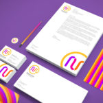
Stobitan Sports Surfaces from Stewart Design
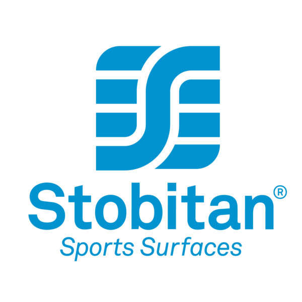
Stobitan, a division of STOCKMEIER Urethanes, specializes in the production of sports surfaces, particularly track and field. This concept is a combination of a letter mark (S) and pictorial mark. The negative space resembles not only track lanes, but also the lines on an athletic field. Additionally, the grid that the shapes form mimic that of the bottom of a shoe. The repeated shapes communicate reliability and trust. Its geometric construction conveys both organization and efficiency and provides a simple, highly versatile mark.
Reader’s Choice in the Identity Application Category:
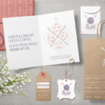
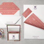
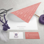
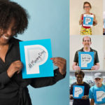
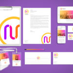
Make-a-Wish from Rule29
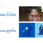
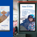
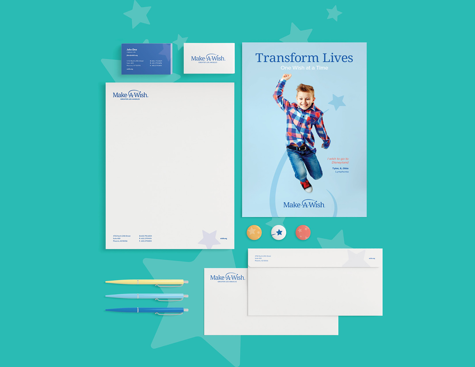
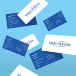
With their trademark swirl and star, Make-A-Wish is one of the most recognizable non-profits in the world. However, it had been quite some time since Make-A-Wish had taken a comprehensive look at their entire brand and they realized that the organization had grown beyond the dated look and feel of their logo and identity. In 2015, Make-A-Wish decided it was time to create one, truly global brand…and we got the chance to get in on it!
Winners in the Logo Design Category
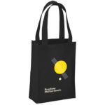
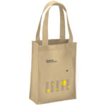
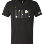
1. Bandung Philharmonic from KUDOS Design Collaboratory
![]()
Bandung Philharmonic is an orchestra group based in the capital of West Java, Indonesia. Formed in 2014, the orchestra has performed various arrangements, from international treasures to original compositions that incorporate traditional Sundanese bamboo instruments like the angklung and kentongan.
We created a logo lockup composed of a musical bar, a yellow dot, and a logotype. When applied to wearables, the logo lockup can be detached to create new forms of compositions. For their title sequence, logo follows a movement of organic lines and shapes as if drawing a traditional Indonesian Batik fabric motives.
2. Civic Music Association of Des Moines from Eight Seven Central
The Civic Music Association logo mark is specifically designed to attract interest, and invite interpretation. The mark evokes imagery such as cityscape, concert audience, or even ear and sound waves. The mark consists of the letters C M A. The C is intentionally more recognizable to act as visual entry point.
The geometric forms are influenced through the golden ratio and the musical staff. The mark translates into a playable piece of music to be interpreted by musicians at the beginning of concerts. The violet color lends itself to excitement, creativity, passion, and quality. Repeat mark pattern captures visual energy.
3. Equal Justice Initiative: Broken Chain Museum from Turner Duckworth
![]()
At the heart of the identity is a symbol that implores us to break the cycle of injustice. Inspired by the name Equal Justice Initiative, two equal letter Js form a broken chain, which not only encapsulates a larger purpose, but also became the symbol for the new Legacy Museum. The bold simplicity of the broken chain led to a series of illustrations that aim to illuminate EJI’s key themes and ideas with immediacy.
4. Graem Nuts and Chocolate from Vervaine Design Studio, Inc
![]()
Graem Nuts and Chocolate is a European inspired nut roaster, specializing in nuts, chocolate and dried fruit. We created a modern “squirrel” logo that is reminiscent of Scandinavian design, using simple geometric shapes to compose the squirrel. The classic color palette fits in well in Historic Concord, MA, and will look great in future locations as well.
5. Identity Museum Reinhard Ernst from Q
Three thoughts guided our creation of the identity for this museum with its focus on abstract art:
(1) Because abstraction is the process of omitting parts or elements, we cut out a portion of the letter forms in the acronym.
(2) The museum’s building, designed by famous Japanese architect Fumihiko Maki, is based on a distinctive concept: Viewed from from above, the building’s plan reveals that a large square atrium is cut out of the building corpus.
(3) The square open space symbolizes paintings or works of art that will be displayed in the museum. It also conveys a sense of the mental openness that we practice while contemplating abstract art.
The letterforms are arranged in a meaningful hierarchy: Under the sheltering M (for museum), the letters R and E (for Reinhard Ernst, the donator of the museum) stand next to each other to create a compact body. Despite the cut-out abstraction, the letters are still legible. The mind of the viewer adds the missing parts.
For this acronym, we used lower-case letters from Helvetica, probably the most objective typeface in the world. The font, created 1956, is omnipresent throughout the world and spans the time of the art displayed in the museum (paintings, photography, and sculpture from the 1950s to the present).
6. OnWatch from Malouf
OnWatch is an online training program, sponsored by The Malouf Foundation, to become an advocate for anti-human sex trafficking. The logo represents the action of opening our eyes and being aware of our surroundings and the signs of trafficking, with the sole purpose of saving as many children as we can. As a tertiary story the logo illustrates someone shining a light on this epidemic and becoming an active participant in the cause.
7. Pattakos Law Lion from KRON CORP
![]()
Combined the scales of justice with the a lion icon to create a memorable mark for the law firm.
8. ROSIE from Fried Design Company
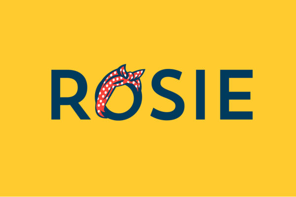
ROSIE supports, assists and serves as an advocate network for current and prospective female founders, business owners, and leaders. They wanted a brand that reflected the courage it takes to step into a leadership role and also display a sense of female pride. Of course Rosie The Riveter made the perfect example. Using the “ROSIE-O” headband as the centrepiece of the logo and touch points, we created a brand that leads by example.
9. Smart Taipei from RedPeak Asia
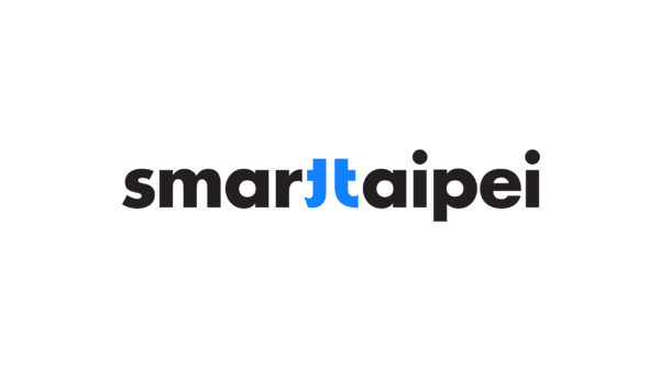
Smart Taipei is a city transformation program that turns the city into a testing ground for innovations. In the logo design, the two T’s from Smart and Taipei are connected to form the Chinese character for Taipei. In applications, the character can open up (separation of Smart and Taipei) to symbolize a welcoming attitude, while the space between alludes to endless possibilities. Vibrant colors reflect diverse aspects of smart living in Taipei. Dynamic and vibrant, the brand design presents Taipei as the breeding ground for pioneering ideas, where possibilities take shape and grow.
Winners in the Identity Application Category
Note: Images are cropped; please click to enlarge images and view all identity applications images. Some projects also include videos.
1. Bandung Philharmonic from KUDOS Design Collaboratory
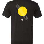
Bandung Philharmonic is an orchestra group based in the capital of West Java, Indonesia. Formed in 2014, the orchestra has performed various arrangements, from international treasures to original compositions that incorporate traditional Sundanese bamboo instruments like the angklung and kentongan.
We created a logo lockup composed of a musical bar, a yellow dot, and a logotype. When applied to wearables, the logo lockup can be detached to create new forms of compositions.
For their title sequence, logo follows a movement of organic lines and shapes as if drawing a traditional Indonesian Batik fabric motives.
2. Britt’s Knit Stitch from Mark Sposato
Hand-made logo and identity for an artisan of knitted goods. Britt taught herself to knit while staying at home with her newborn son and faithful Dachshund-Lab mix. Soon, this hobby became a passion, and it was time for her to start a business. I crafted a mark that reflected the humanistic and off-beat beauty of her custom knitwear and goods. Britt asked for a visual language that reflected pride in her Native American heritage, a well as the inspiration she derives from her family. All of her knits are handmade with love.
3. Cutters Sports Branding from Sussner Design Co
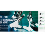
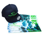
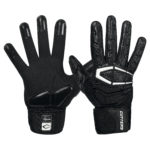
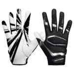
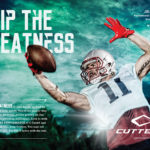
The grip on Cutters gloves is the highest performing in the football category. But the brand had not been refreshed since 2004, and felt their identity appeared dated and no longer in sync with the marketplace where flashy prevails.
To support at the launch of their restyled football glove, Sussner Design Co created a new, compelling brand identity that conveyed an evolved personality, speed and high performance for the Cutters brand. Grip The Greatness.
4. Dad’s Donuts from 3 Peaks Design by Printful
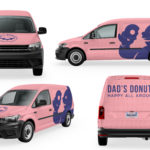
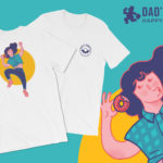
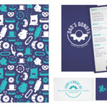
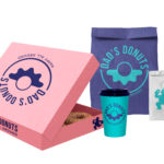
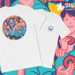
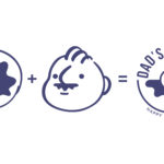
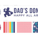
The brand identity for Dad’s Donuts - an acclaimed mom-and-pop donut shop in Los Angeles - is inspired by donuts and the quintessential dad mustache. The palette is strategically based on the classic pink donut box, a detail that originated in California. The various design elements provide a nostalgic feel and make the viewer feel at home - as if they were visiting family. The circle is intended to give the on-the-go feel while utilizing the typical shape of a donut. This shape is repeated and emphasized throughout the branding elements.
5. Parkinson’s Foundation from Ultravirgo
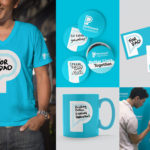
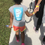
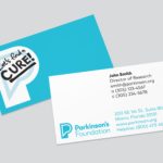
The logo is specifically designed to serve as a platform for community expression, offering an open prompt for individuals to hand-write their own messages to personalize materials. Inspired by the custom t-shirts that families make for their popular fundraising walks, we built the entire system from the ground up to foster personalization. The identity has been met with enthusiasm from board, staff, and public including people with Parkinson’s. The brand launched with a social media campaign inspiring hundreds of people to write their messages on the logo, followed by a broader awareness campaign during Parkinson’s Awareness month, generating thousands more shared across social media.
6. Milestones Psychology from Mark Sposato
Milestones Psychology is a group of multidisciplinary clinicians who specialize in working with children and families from pre-school to college. I worked closely with the founders to design a mark, identity system, and extended brand halo that captured the positive, cheerful, yet systematic personality of their child-based psychology practice. The M monogram is built out of sections that represent steps, or milestones on the road to mental wellness. The idea of progression and vibrancy was carried out through the design of the logo, company web site, corporate identity, promotions, and collateral items.
7. Perfect Day at CocoCay from Royal Caribbean International
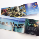
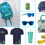
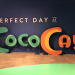
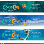
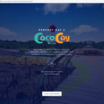
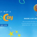
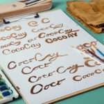
Royal Caribbean is creating an entirely new private island experience in CocoCay, Bahamas — introducing several record-breaking attractions like the tallest waterslide in North America and the largest wave pool in the Caribbean. To capture the essence of our new destination, we created a custom logo for use in all brand marketing on and off the island. The logo is built on the existing CocoCay name, drawn by hand and brought to life through vibrant colors and organic textures that evoke The Bahamas. The identity is being further reinforced in signage around the island and logo merchandise available to the guest.
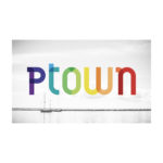
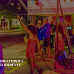
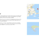
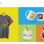
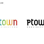
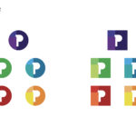
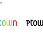
8. Provincetown from Vic Rodriguez, Texas State University
9. Tribe Street Kitchen from Sullivan Higdon & Sink
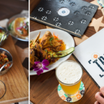
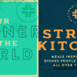
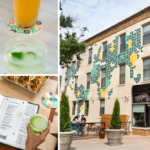
Tribe Street Kitchen may be located in Kansas City, but this restaurant’s vision goes way beyond the heart of the Midwest. The unique menu celebrates iconic street food flavors from all over the world, and the visual identity needed to pull those influences together. But the look and feel wasn’t limited to typical restaurant collateral like menus and glassware. Tribe was able to make its mark on Kansas City’s River Market district by introducing a building-size mural as well as custom-welded metal signage. These handmade touches reflect the craftsmanship that has gone into global street food for centuries.
Be sure to enter your best design to the HOW Design Competition awards. Submit your entries now!