


Struggle no more with finding the best typeface combinations for your creative projects, and instead utilize the 150 examples provided in Type Teams by Tony Seddon.
by Nadine Chahine
Monotype’s Font Marathon: A Look Inside the Exhilarating Challenge for Two Typeface Designers to Create Two Typefaces from Scratch in a Matter of Days
Designing a typeface is often an intense, exhausting, challenging and yet rewarding process. As designers know, it can take several months or even years to design a beautiful typeface family. It requires a lot of talent, specialized expertise and precision. But what if the challenge were to create a typeface in just a few days? And do it without any creative restrictions, while letting your design unfold in front of the lens of social media?
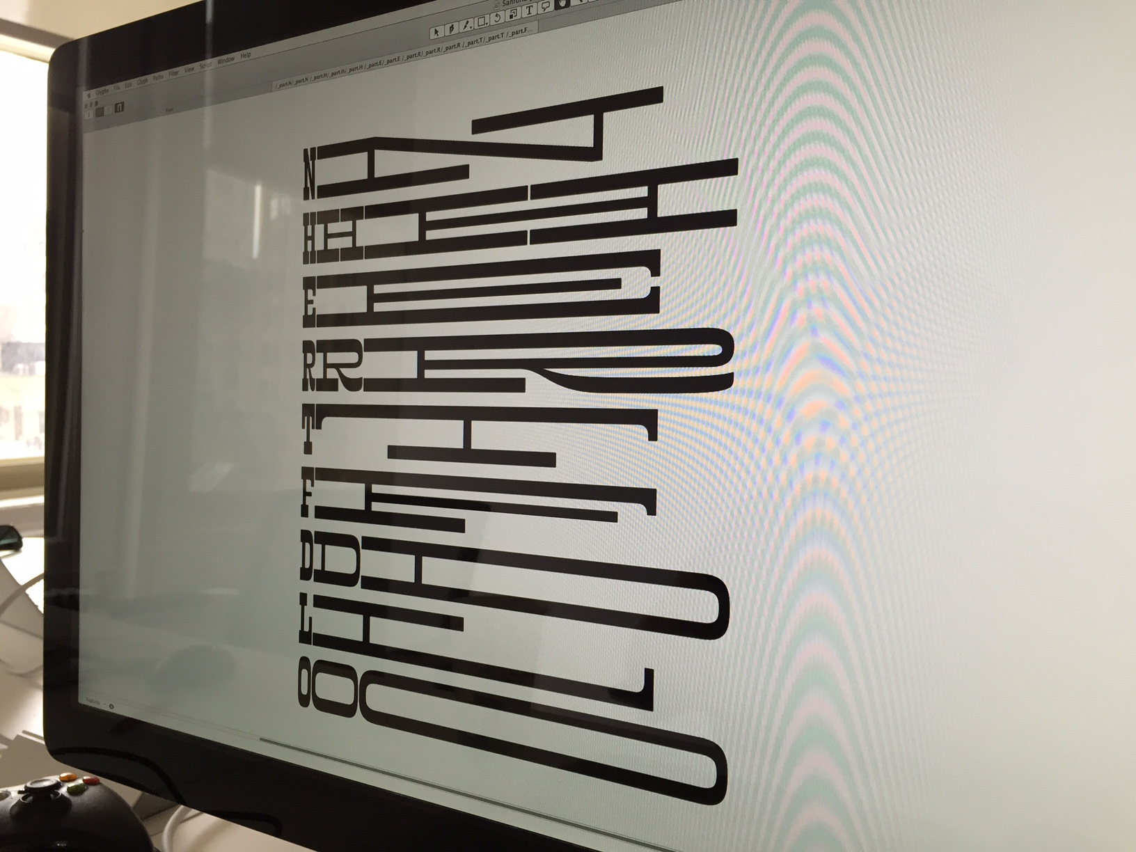
That was the idea behind Monotype’s recent Font Marathon. On May 4, two of Monotype’s top typeface designers, Toshi Omagari and Jim Ford each stationed themselves in Monotype’s New York City office to do nothing but think and breathe rapid ‘typeface design’ for roughly 72 hours, and bring their creative ideas to life. Through Twitter, Instagram and Facebook, the public was treated to rare glimpses of the typeface design process, something’s that’s almost always done behind closed doors—and usually constrained to specific design requirements or client briefs. This was a chance for Toshi and Jim to reach within themselves to create a personal design and have a little fun in the process.
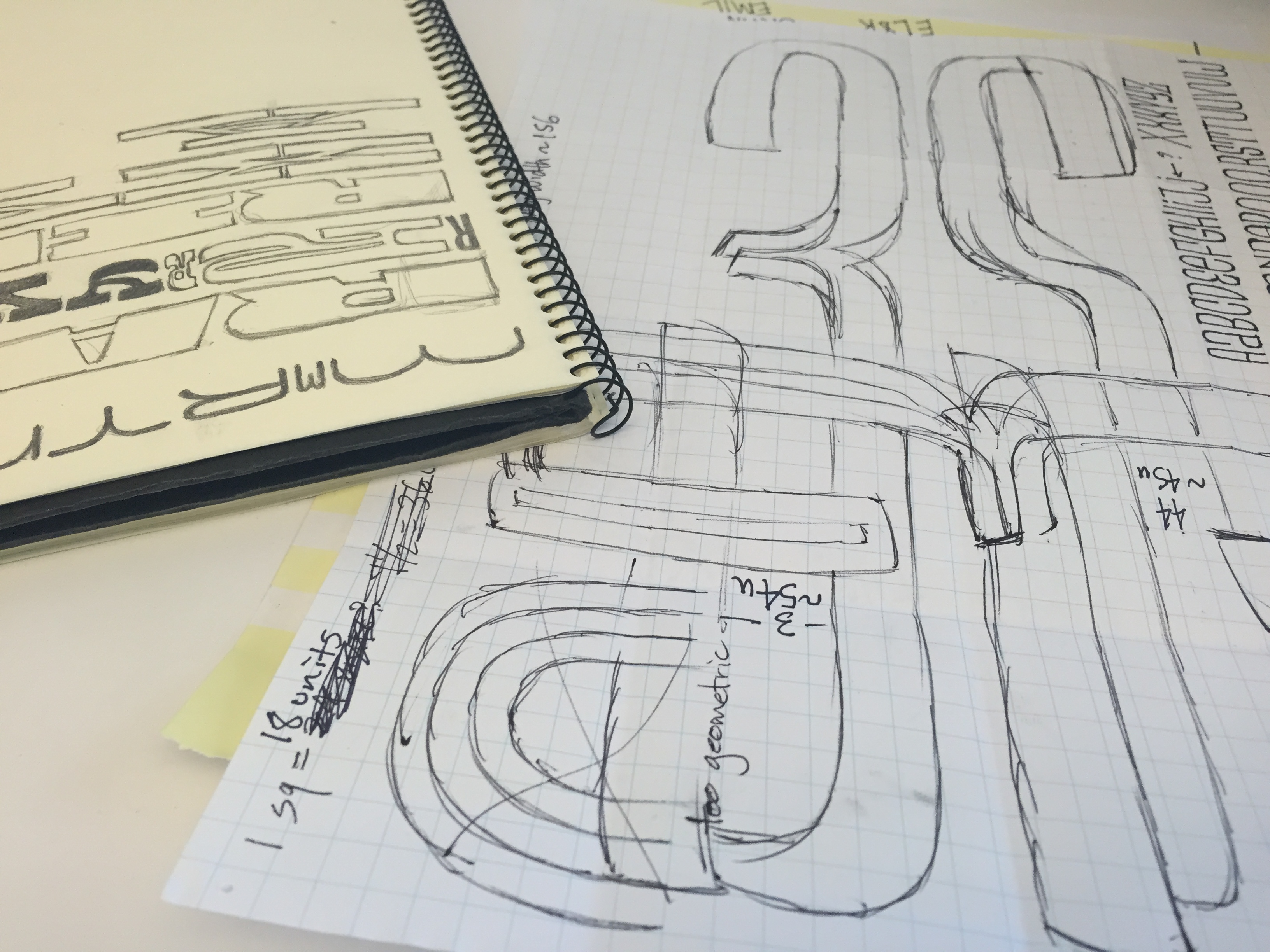
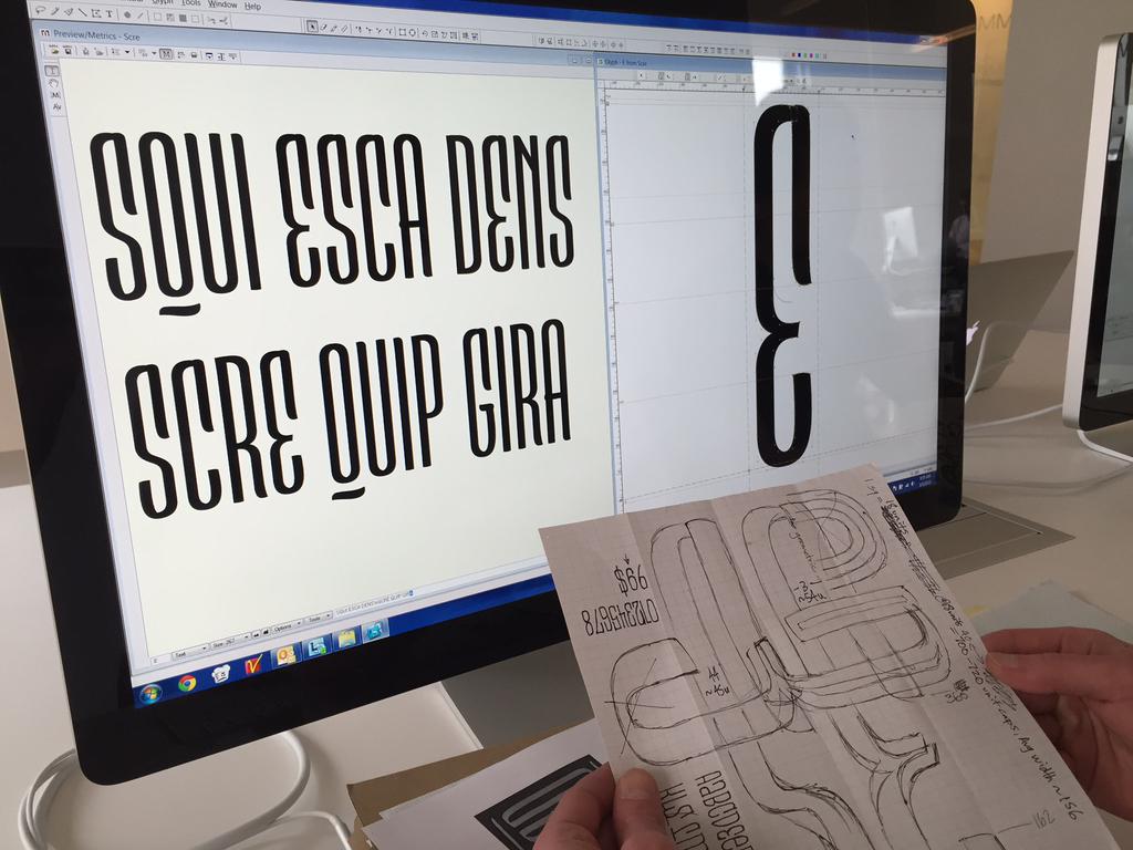
initial sketches by Toshi Omagari and Jim Ford
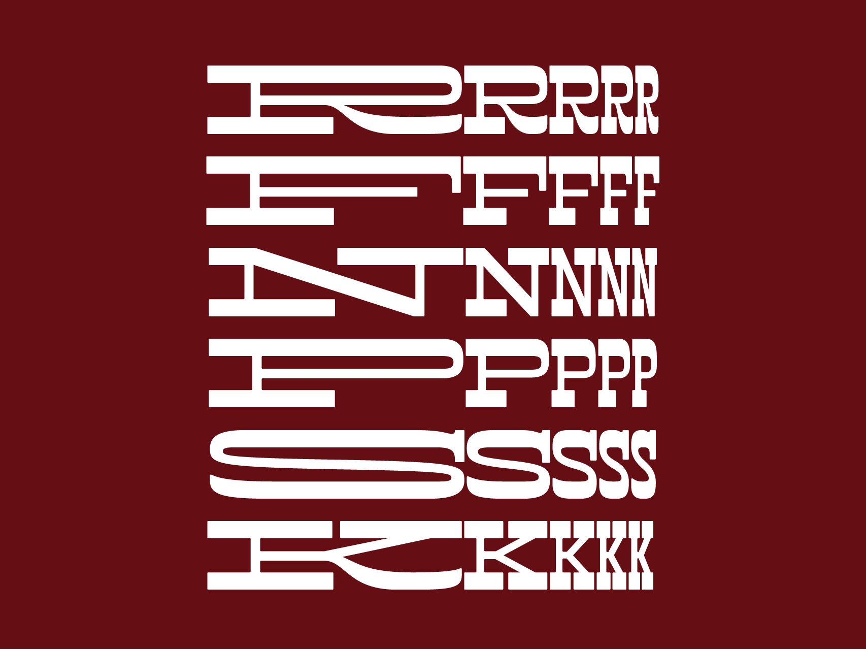
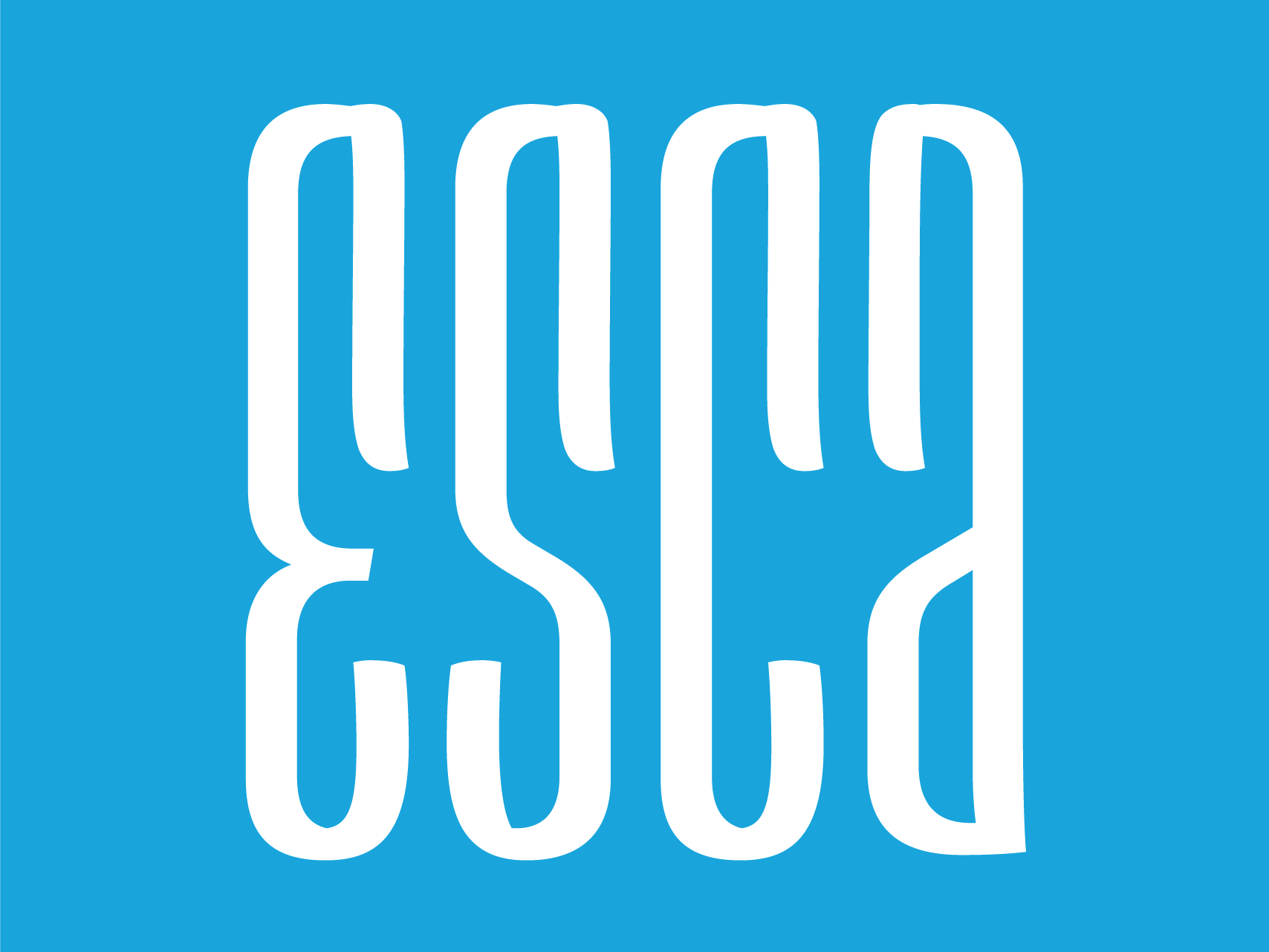
At week’s end, two brand new typefaces were welcomed to the world: Toshi’s Cowhand design—a reversed-stress, roman typeface that sticks to the same width for every word—and Jim’s Esca typeface, an ultra-condensed, upbeat, unicase design that offers a touch of calligraphy and brush lettering. Both typefaces are available from MyFonts, Fonts.com and Linotype.com, with proceeds going to Room to Read, a literacy-focused non-profit organization.
Cowhand
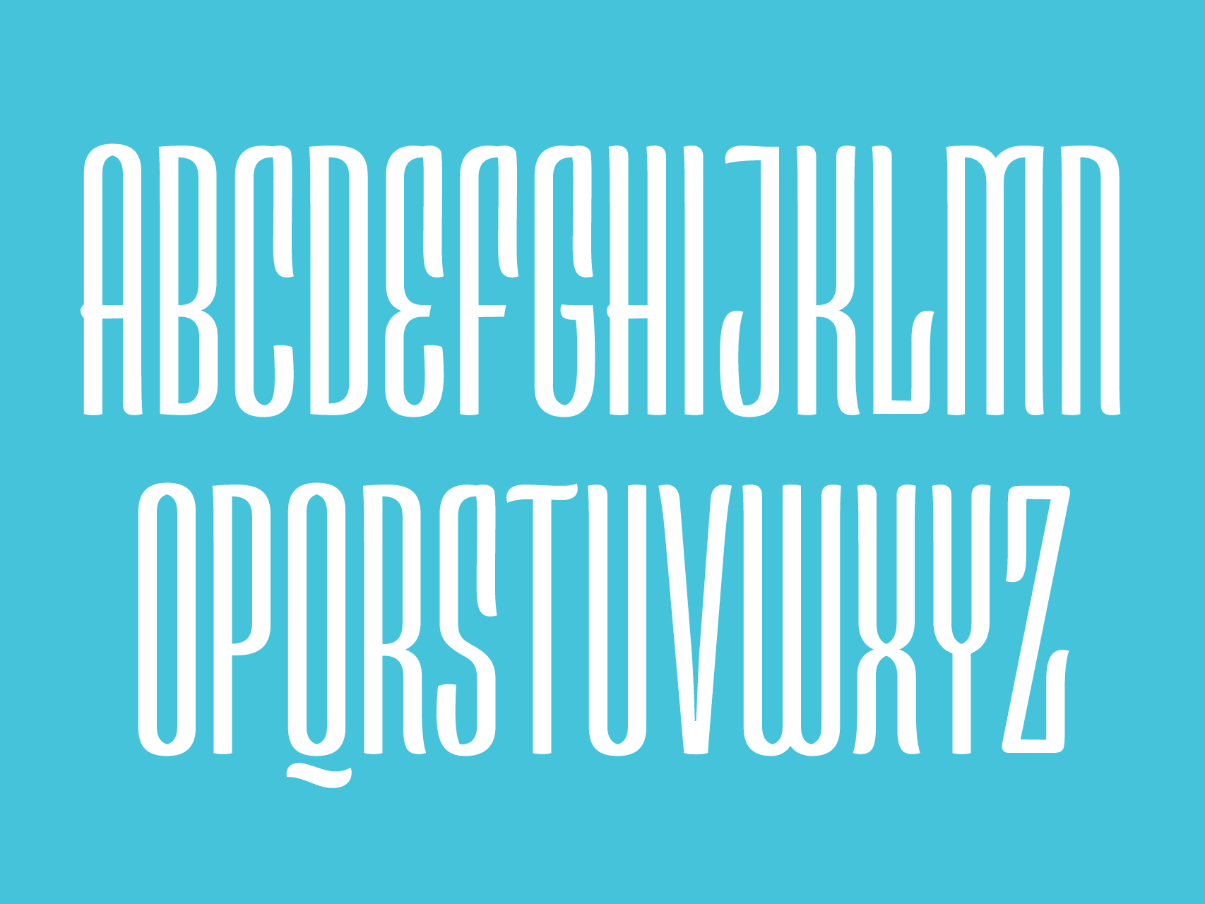
Esca
“I like the exercise of making quick decisions, committing to them, and then running with them,” said Jim, referring to his design approach under the time constraints of the marathon. Esca, a typeface that was never on his to-do list, packs “a lot of fun characters per line,” he said. He sees it as useful for posters, album covers, packaging, logos, short headlines and title sequences. “It’s something I’ve wanted as a graphic designer, and I would totally use it,” he added.
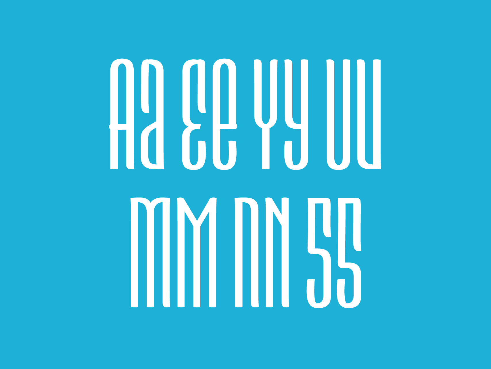
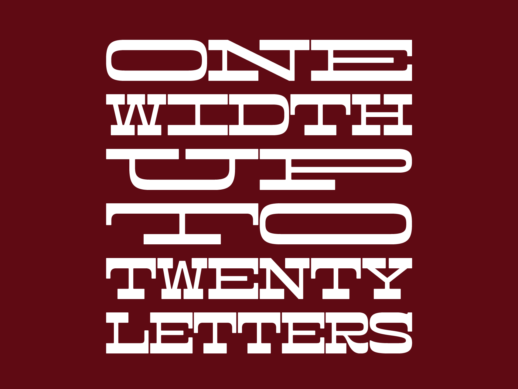
Toshi’s design idea integrated a unique, dynamic feel. His Cowhand retains the same width for every word up to a maximum of 20 characters. “Lowercase exists to fill the glyph set, but the all-cap setting is where the magic happens,” he said. Toshi envisions Cowhand being used for display purposes like posters or magazine spreads.
I had the privilege of observing and encouraging Toshi and Jim throughout the event, and it brought me back to when I first came up with the idea of a Font Marathon last November. At that time, I challenged myself to design a new Arabic typeface over a weekend, and share my progress over social media. Creating a typeface in so little time forced me to make intuitive decisions that I might otherwise not have made. The process was so much fun that I wanted my colleagues to share in this experience. It was really gratifying to give space to our designers to push boundaries and deliver on such short notice.
I really believe our recent Font Marathon succeeded in shining a spotlight on the ‘faces behind the faces,’ giving social communities a peek inside the art of designing type—a talent that few people possess—with real typefaces to show at the end of the week. Yes, the designs did not include expert kerning, multiple weights and languages—all of this would’ve certainly required more time. But with a ticking clock, encouraging support, and the freedom to tap into their deepest levels of creative inspiration, Jim and Toshi were able to design two unique typefaces in very little time—and all told it added up to one unforgettable experience.
Dr. Nadine Chahine, an award-winning Lebanese typeface designer, is an Arabic and legibility specialist at Monotype. She has a master of arts in typeface design from the University of Reading, U.K., and a Ph.D. from Leiden University, The Netherlands. Nadine’s research focus is on eye movement and legibility studies for the Arabic, Latin, and Chinese scripts. She has won numerous awards including awards for excellence in type design from the Type Directors Club in New York in 2008 and 2011. Her typefaces include the best-selling Frutiger Arabic, Neue Helvetica Arabic, Univers Next Arabic, Palatino and Palatino Sans Arabic and Koufiya designs.
Nadine’s work has been featured in the 5th edition of Megg’s History of Graphic Design. In 2012, she was selected by Fast Company as one of its 100 Most Creative People in Business. In 2014, Nadine was named to the publication’s list of the Most Creative People in Business 1000.
 Typography 35: The Annual of the Type Directors Club
Typography 35, the 35th edition of the only annual publication devoted entirely to the art of type. Approximately 2,300 designs were submitted from around the world, and a select few made the cut. Of the type designs chosen, all of them are models of excellence and innovation, and represent a variety of categories and mediums, including magazines, books, corporate branding, logos, annual reports, stationery, posters, and video and web graphics. Get it here.
Fantastic again. Another really good quality article. Love the sketch initial work. Andy @ Idepop Graphic Design