


As a type designer, what if you had an idea for a typeface, and had begun experimenting with its design, but didn’t have the resources to continue the work? Future Fonts could help with that. Or as a graphic designer, you were looking for “fresh fonts” that haven’t been used over and over again—wanting something new and exciting, perhaps getting it even before it’s been released? Future Fonts could also help with that. Future Fonts is a new endeavor brought to life by Lizy Gershenzon & Travis Kochel of Scribble Tone, with OH no Type Co.’s James Edmondson working as an advisor who’s focused on education and helping to build the community.
Gershenzon sees their platform built for type designers to raise funds, get early feedback, and sell typefaces in progress. Edmondson says Future Fonts has elements of Kickstarter, Patreon and Github. Gershenzon, Kochel and Edmondson shared their insights about typography, their thoughts on starting Future Fonts, and what the future of type and type design could look like.
Q. Future Fonts is not only a smart idea, but it also fills a gap—and fills it well. There’s a lot of interest in type design, with people jumping into the game constantly. Why haven’t we seen something like Future Fonts before, especially since type design has been blowing up, with new fonts constantly coming out?
Travis: I think we haven’t seen something similar because it’s terrifying to put something out there that’s unfinished or imperfect. We can’t take all the credit though. Various foundries have experimented with releasing fonts that don’t have a full family of weights or limited character set. Production Type’s Lab, and David Jonathan Ross’ Font of the Month Club come to mind. Some designers have used Kickstarter to fund the process. OpenSource fonts use this model. I think we’re the first font retailer that has made it a core part of the platform though.
James: Swiss Typefaces also had the “Lab” thing maybe even before Production Type.
Lizy: It’s a new idea for typeface design, and it could be hard for a small independent team to take on a bigger project like this. You need to be tied in to what’s needed in the type scene, have the skills to design and build a custom digital product, and get designers behind it. I think the three of us have unique talents that complement each other well for this sort of project.
Q. What about the name, Future Fonts? Why not Font Starter or Fontstarter? Or is that too similar to Kickstarter? Actually, it is too similar to Kickstarter. Bad question … anyhow, what other names were you thinking about, and why did you stick with Future Fonts?
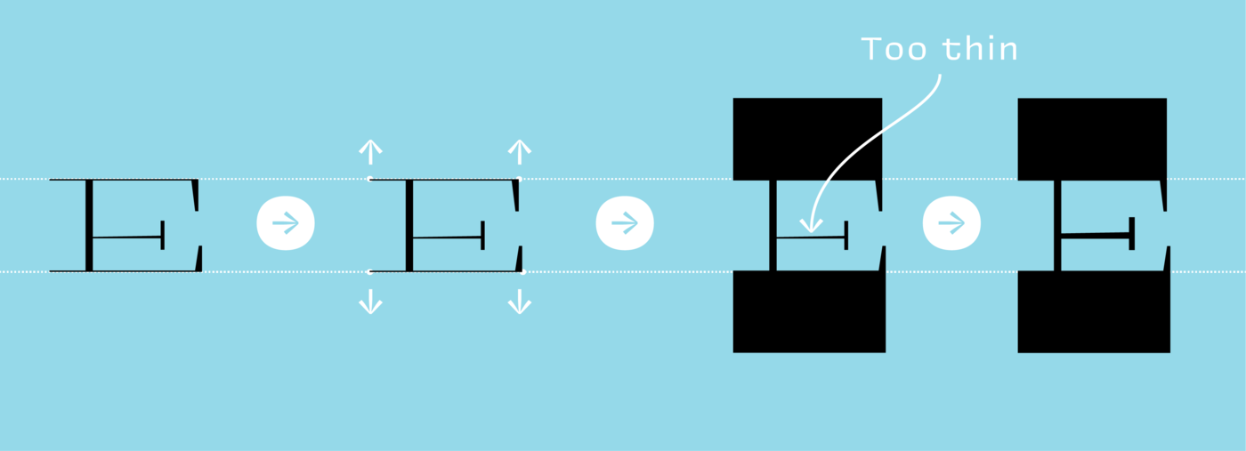
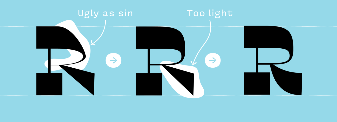
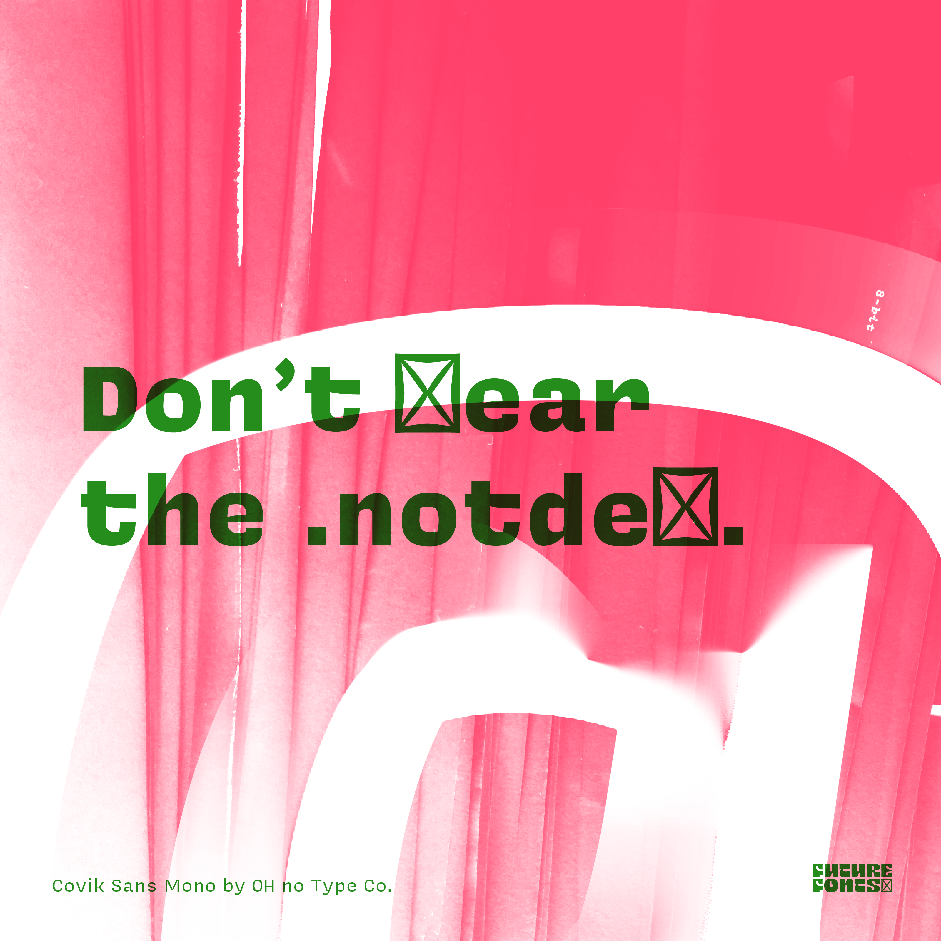
Travis: We went through a lot of names in the early days. AlphaBetaType, clever, but there are a lot of similar names out there. Incremental, a little too serious. We almost went with ‘Not Defined’, which is the name of the glyph that gets swapped in when a font is missing that specific glyph. We were worried it was a little too hard to get if you aren’t a type designer. Future Fonts is a little too obvious, but it’s fun to say. People seem to have an easier time remembering it and are quicker to understand what we’re doing.
James: At first, I hated the name Future Fonts because I thought it was corny. A few days after I had described it to my partner, she asked, “What’s up with that Future Fonts thing?” I realized she remembered it after I had mentioned it once, so that despite being maybe a little obvious, it was memorable and straightforward.
 Future Fonts shares reverse contrast principles at their blog in a post by James Edmondson.
Q. James, you wrote a nifty post on the blog all about reverse contrast, and it’s a very educational piece. Do you worry that you’re giving too much away? Would sharing too much of your secret sauce, or any of the ingredients that go into a Future Fonts creation, harm the growth of Future Fonts in the long run? Or are you counting on people creating, designing and building, and then sharing those typefaces on the Future Fonts platform?
James: I don’t worry about giving too much away. From my experience learning in school and teaching, I know how difficult it is to impart a meaningful understanding of type design on students. I am completely happy to teach people because there are many benefits. First of all, people realize how difficult it is, which lets them understand why fonts cost money. Secondly, I think it would be wonderful if designers were more able to treat type like a raw material, rather than simply clip-art. There is an understandable fear of editing/ customizing/ tweaking type. Maybe with a little education in this area, designers will have the confidence to insert more of their own voice to get the type working better for the project and produce unique work. These ideas are more important to me than hoarding information in the name of shortsighted financial success.
Lizy: We are also hoping to grow Future Fonts out more as an educational typeface design resource. First, we were thinking about how to dissect the progress of a typeface to help people better understand what they were getting and learn more about the process. A blog was a nice addition to help designers teach about making typefaces and designing with them. We hope to build out more educational tools for Future Fonts.
Q. James, you occupy a special place at Future Fonts as an advisor, and when it comes to things like that blog post, you’re also an educator, writing about and teaching people about type on the Future Fonts site. For all that you’ve put into Future Fonts up until now, and what you will put into it in years to come, what’s the big payoff for you and why?
James: Education is important to me because of how many great teachers I had. Angie Wang was my first typography teacher, and taking her class was a huge awakening. In that one semester, I learned so many things I still think about daily; in fact undergrad through grad school was one awesome learning experience after another. I hope I can be that teacher for others, and selfishly, being around students allows me to maintain enthusiasm in my own job. After I left grad school, it became annoying to hear my teacher’s voices echo in my head as I was working. Now I’m hearing my own voice echo in my head as I’m working, which is way more annoying, but it keeps me practicing what I preach.
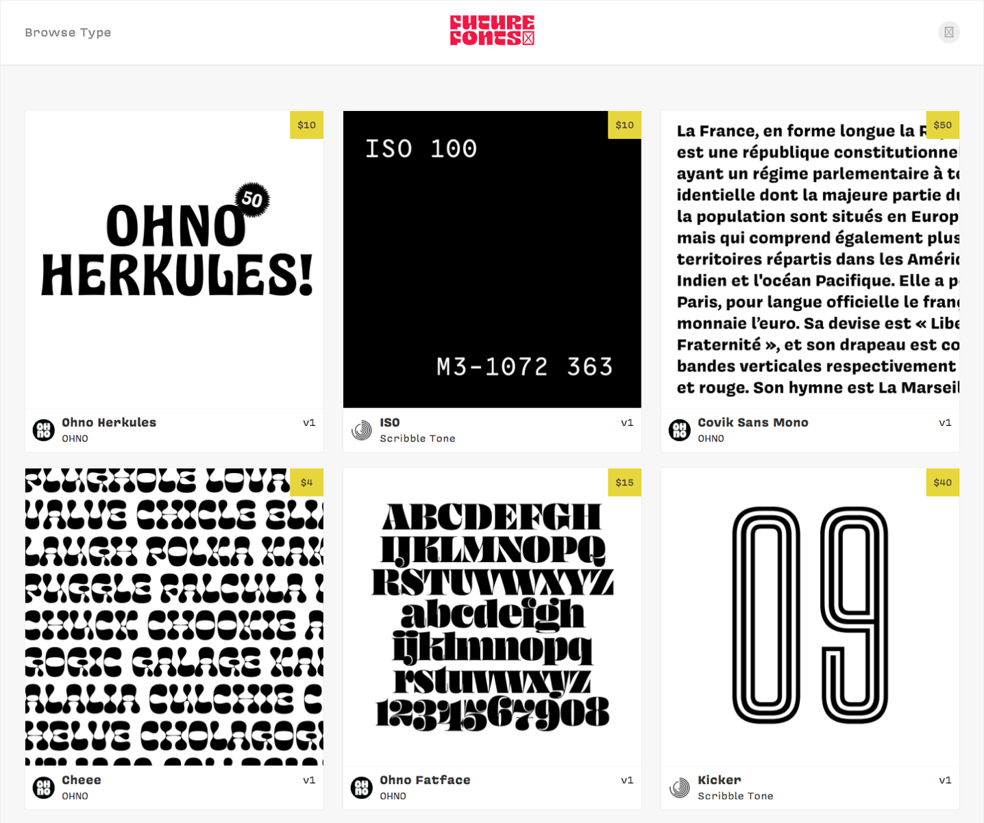
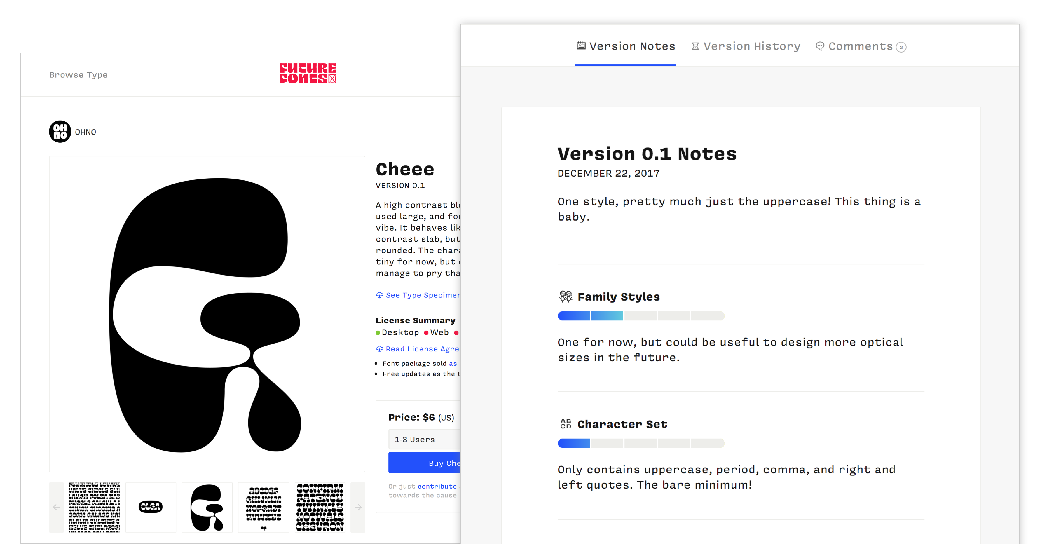
Q. At your site, your FAQ section states that you “don’t require that every typeface is eventually finished,” which makes me wonder, what would you consider to be a successful year or quarter? If 80% of the typefaces get finished, or more like 20%? Or do you not worry so much about the numbers, but perhaps, you define success another way?
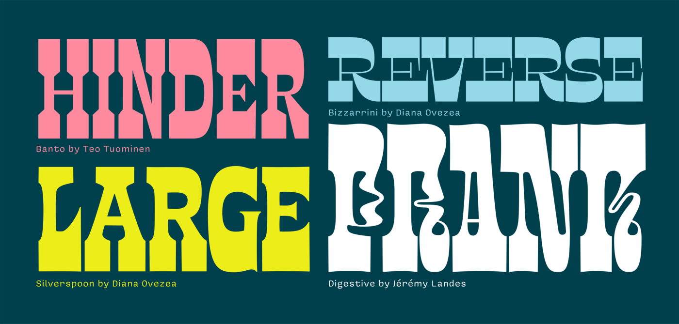
James: Forgive me if my opinions don’t reflect those of my colleagues, but on Future Fonts, I define success by the catalog we offer. This is as much about pushing type design forward with interesting contributions as it is about offering a new model for sales. If we were primarily concerned with the numbers, that would lead to a library that was considerably more boring.
Travis: Yeah, I agree. I don’t think finished is something we’re using as a measure of success. The idea of what qualifies as “finished” is very subjective. Even well-polished “finished” fonts usually have room for expansion of character set, weights and widths. The three goals I’m most interested in are: 1) providing a safe place for type designers to experiment and grow their ideas, 2) offering a great library of typefaces, and 3) trying to close the gap between type designers and type users. They’re not really quantifiable, but just things to help guide decision making. However, I definitely hope to see the typefaces progress, and will be sad if they get abandoned. We’re trying to pick designers that are serious about their work, so I hope the number of abandoned projects will be fairly low.

Q. Future Fonts looks and feels inclusive, as if you won’t say “No” to any submission—and I think that’s really cool. But, where would you draw the line? What won’t you accept into your catalog, and why?
Travis: We have turned down quite a few submissions actually. In the early going, we feel it’s important to set expectations for both the designers and customers. While the typefaces are in-progress, what is present should be usable, of high quality and creatively interesting. In the long term, we would love to create a more open environment, but it would probably be a bit separate from the Future Fonts brand. We’ve also floated the idea of making a critique section where anyone could post work to get feedback and help.
Q. A critique, education and feedback area would be wonderful. Would it be similar to, different from, or the same as Type Drawers? Do you see something like what you’re envisioning being a replacement for Type Drawers, or adding to what Type Drawers already has in place?
James: We want to have designers feel comfortable giving any feedback related to using the type. Other communities of type designers can offer critiques to make it be the best expression of it as a typeface, but we feel that feedback that comes from a user, or an actual paying customer might be more useful.
Travis: It’s not something we’ve given a whole lot of thought about yet. Growing and maintaining the current library and feature set has been keeping us pretty busy. But, I think we’ll probably want to take it a little further than Type Drawers if we do it. The forum format works, but it would be nice to create a more helpful interface for critiquing, with type design in mind. Again though, this is probably pretty far off in the future, and separate from the licensing side.
Q. Lizy, your bio at Scribble Tone says that you have “a gift for connecting with people and making a project come alive.” What are some of the ways you hope that contributors’ typefaces will come alive when they work with Future Fonts, and how will you be a part of that coming alive?
Lizy: We created Future Fonts as a way for typeface designers to get their projects out sooner, so others can use their useful designs. Hopefully this early feedback loop will encourage designers to keep working on it, get fresh designs out there quicker, and help them make some money along the way. It has also been fun to see typeface designers on the platform and from the design community support each other with feedback, advice, and helping spread the word on new typeface releases. Throughout this project, I’ve tried to take Travis’ initial prototype of releasing typefaces in versions and push the vision so it’s more exciting to a larger design community. Figuring out things like how will type designers upload and sell their work, what’s a nice way to browse and show-off typefaces, and how do we make it feel like a community that’s supporting each other. Lately, I’ve been focusing on getting more designers to check out Future Fonts, and how to help make the product better.
 Travis Kochel’s FF Chartwell is a unique typeface that goes far beyond letters, numbers, and symbols.
Q. Travis, you have experience with type design and technology, such as pushing the envelope with FF Chartwell and its OpenType capabilities, creating a font that calls on typography, mathematics, programming, color and graphics. That font appears to be the perfect blend of your experience and interest in typography, graphic design and backend development. How has that experience, and your other experiences with type design and technology—as well as your entrepreneurial spirit—factored into your vision for Future Fonts, and where you want to take it five, 10, 20 years from now?
Travis: I’m always looking for ways to bring together all of my separate interests. I’m not the best at any one thing I do, but my strength is in bringing different perspectives to fields or technologies that don’t usually talk to each other. It’s been really important for me to explore new technologies and ways of thinking, and to be OK with spending a lot of time learning something that may not directly relate to what I’m working on at the moment. With Future Fonts, I hope to keep that same spirit of learning and exploration going. We have a good backlog of useful and necessary features for the site, but I think it’s important that we follow our curiosity and mix in some things that are more satisfying on a personal level. As a platform, I hope we can help encourage this in the designers as well. I’m so glad James is involved in this project. He’s done an amazing job of curating and encouraging exactly that in the library.
Q. With a name like Future Fonts, people might presume you have an eye on what’s next in the type world, for type designers and also for graphic designers and everyone else who uses type. What do you see happening next in the world of type design, specifically for the type designers making type, how they work, their distribution model(s), and also the way people use their type?
James: We are in the golden age of type design. The education, tools, and communities around it have never been stronger, so the only trend I can count on is that quality will stay high. For type designers, I hope they can realize the importance of owning their work. With the internet, the importance of huge foundries goes down. Everyone can process credit cards, and everyone has international reach. That will hopefully allow for more designers to stay independent, and not be a part of the Monotype ecosystem that is continually swallowing up the entire business. Monotype has the tendency to buy foundries up and forget about what made them cool in the first place. My hope is that by keeping the decisions about what type gets made out of the hands of huge companies, it will allow for more progressive and boundary-pushing work.
Lizy: I agree, Future Fonts is a new tool to give type designers more control over their work, which is really needed in today’s type industry. I also see it as a place where designers across disciplines can discover interesting new typefaces and support independent creative work happening today.
Control, discovery, support and creativity—sounds like a bright future for type designers and also graphic designers. You can see more of Future Fonts on Instagram & Twitter.
Edited from a series of electronic interviews.