


Editor’s Note: The following piece was contributed by Kris Travis, a designer for A.wordsmith, a boutique public relations firm in Portland, Oregon. Travis has over a decade of art direction and design experience for clients including Portland Trail Blazers, Waggener Edstrom Worldwide and Wacom Americas. With a keen eye for detail and thoughtful problem-solving skills, Travis helps translate marketing goals into creative, relevant and impactful visual solutions.
Branding a product or service that’s less than sexy has its challenges. Things like banking and health insurance rarely make the heart sing. Yet numerous “boring” brands have found ways to hit it out of the park with their digital communications. Strategic brand and web design tactics play key roles in their success. There are hundreds of ways to spice up a bland brand, but here are five essential design strategies to effectively market a “boring” product or service online.
Clean and Clutter-Free Design
I won’t advocate for strict minimalism where it doesn’t make sense, but with homepage designs, many businesses often try to do too much at once. Frequently overloaded with content, a site homepage may do better acting as the beautiful, can’t-miss book cover.
The push to include everything on the homepage is understandable; there’s a natural fear that the potential consumer won’t stick around if they aren’t clear on the whole story right away. But it’s often the opposite—if you can hook a new visitor with just the right tagline, image, or even mood, they will dive deeper on their own. The key with this approach is “edit to amplify.”
Simple bank has put its name into practice—the homepage is clean, warm and speaks to potential bank customers’ goals (rather than presenting a cold sales pitch). The use of high-quality photography and on-trend, hand-crafted fonts is an engaging, lifestyle-based approach for a company that provides financial services.
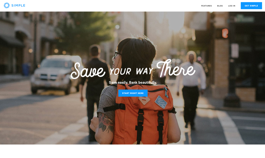 www.simple.com
Integrated Podiatry Clinic rejects the standard medical specialist site approach and showcases the potential beauty of the human foot, overlaid with a bold and clever call to action to “Put your feet in good hands.”
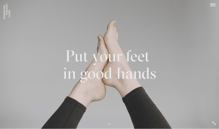
integratedpodiatry.com.au
Consider: How much information do you really need to share up front? Where can you create intrigue and draw users further into your brand experience?
[Learn more in the online course Web Design 101 for Designers—Part 2 Workshop | Course Runs: Oct. 10th–Oct. 24th 2016]
Fewer Choices
Ever felt like a deer in the headlights in the grocery store cereal aisle? American brands are really good at providing choice—lots of it. But sometimes too much choice is overwhelming, and consequently, detrimental to the user experience. If you have a specific path you want the user to follow, design accordingly. Providing them with too many navigation choices may backfire, and they could leave the site before trying any of them.
Oscar’s health insurance site minimizes the main navigation bar to an expandable menu, and focuses user attention directly on a clear introduction and “get your quote” call to action. Scrolling reveals more information, but many users will appreciate the focus and clarity of the single action item when landing on the site.
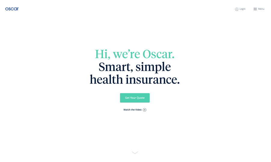
www.hioscar.com
Consider: Are you providing too much choice? How can you limit decisions to improve user experience?
Be Brave (And Embrace Good Design)
Just because the product or subject matter is a bit dry doesn’t mean the design has to be. Conservative brands often shy away from embracing the latest design trends, afraid to rock the boat and scare off potential customers. While it’s important to carefully consider the end user, a little more design risk could result in bigger rewards, warmer brand feelings and stronger customer loyalty.
Kinetic Superannuation doesn’t shy away from bold photography and bright colors, along with a bold call to action to “Get Your Super Moving.”
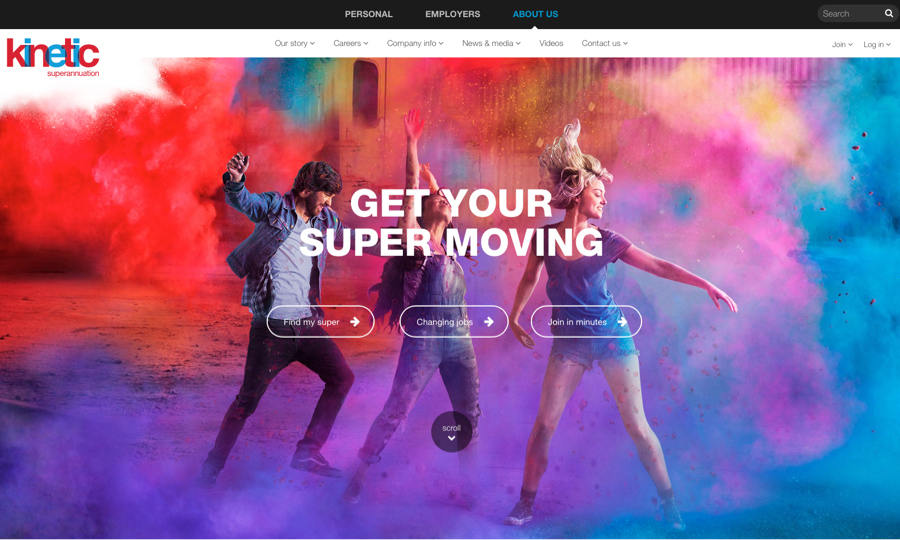
www.kineticsuper.com.au/personal
Charles Milnes & Company provides insurance and risk management, but isn’t afraid to take design risks: bright colors, bold shapes and dynamic details make for an exciting brand impression.
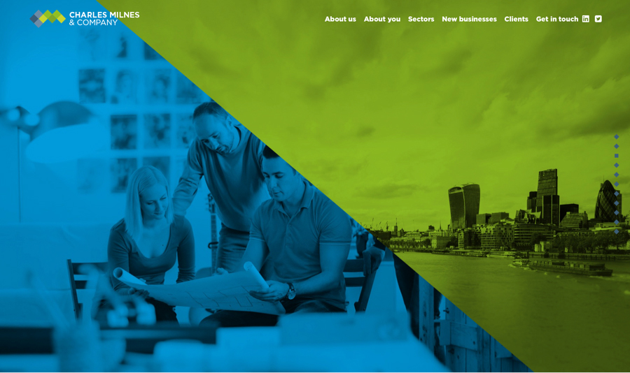
charlesmilnes.co.uk
Consider: Can you push the design a bit further? Can you open up new opportunities with a little brand risk?
“I Feel You”
Be empathetic. Be real. How can you make the user’s experience as easy and seamless as possible—and beyond that, fun? This can be as simple as providing hover tooltips or adding estimated reading time to an article so users can decide whether they have time to click through.
Maybe you humanize an otherwise technical product by adding fun easter eggs. For example, I use Freshbooks to manage my timekeeping and invoices. Tracking time is not my favorite thing to do, but occasionally when I log my time, Freshbooks cheers me on with silly messages like, “Way to go!” or “Pow!” Humorous and unexpected details like these add personality to a pretty square service.
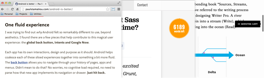
Reading tooltips can help a user decide if they want to finish the article, or bookmark it to read later. Image from css-tricks.com.
Consider: What are your users’ pain points? How can you make their experience painless, and better yet—enjoyable?
Surprise Them With Motion
Video and animation can tell the brand story and establish mood in immediate and impressive ways, and dynamic content of any sort helps a static product or brand feel current and relevant. Video is more popular than ever, and allows for product demonstrations, engaging storytelling, and viral potential.
I would not necessarily expect to see clever video on a cleaning service’s website, but that’s exactly what we get from UK-based Eagle Clean’s homepage—a background video of a quick screen clean (and you can even download their “Screenclean screensaver”). It’s a surprising, delightful and fun addition to what could have been an otherwise boring online brochure about professional cleaning services.
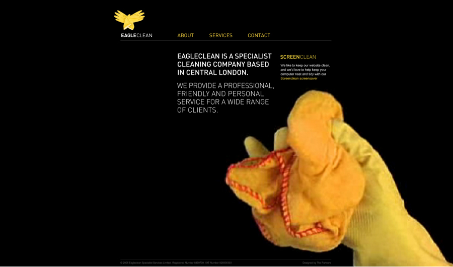
eagleclean.co.uk
ACME’s site feels less like a website and more like a cinematic, immersive experience—all to market services and solutions like “logistics and distribution,” “industrial automation” and “pneumatic and vacuum manipulators.”
acme-experience.com
Consider: How can your organization embrace video and/or motion to tell the product story in clever and compelling ways?
Show Some Respect
When all is said and done, successful design is driven by a respect for your audience, and a thoughtful understanding of how you can make their lives better. Employ smart design strategies to show you care, and your audience will in turn value your brand, no matter how “boring” it seems in the wild landscape of the World Wide Web.
In case you weren’t aware—the HOW Logo Design Awards is bigger and better than ever this year. 10 winning logos, 10 winning identity applications. Landor’s Wally Krantz as your judge—and running a Facebook Live Q+A for ALL Entrants. Not to mention, all new prizes including free tickets to HOW Design Live 2017 and trophies to be presented at the conference. Obviously, we’re very excited for you to enter, and we look forward to seeing your best work!
The blog nice to explain about designing strategy in market. We should make a plan for design a website in better looks for the marketing purpose. We are also a web design company and gives you a better solution for website designing and development strategies. To check the website you can view on myqsoft.com
Simplistic, ‘minimalistic’ design which I favour, from accessibility perspective it certainly makes for better user experience
http://simondesigner.co.uk