


Helvetica has been a typographic workhorse for decades, seemingly everywhere as documented in Gary Hustwit’s 2007 movie. The font looks and feels timeless, but it hasn’t seen a major update since Neue Helvetica in 1983, a time when quarters were required to play video games and AOL had not yet brought America online. A brand new version, Helvetica Now, hopes to solve problems designers face in the 21st century by delivering the breadth a font needs to work across various media and at different sizes. With so many versions of this font family already available, this newest iteration begs the question, “Do you really need Helvetica Now now?”
Helvetica Then
Some say the blessing Helvetica offers is ease of use, but you can have trouble when it comes to choosing the right version, since we have the Helvetica and Neue Helvetica, with many flavors therein such as the Impact-esque Pro Inserat as well as Pro Rounded. You can still use the older, wayback versions, including the original, Neue Haas Grotesk. The 1980s version, Neue Helvetica, had been the newest of the lot until Monotype began work on the latest and greatest version in December 2014. Almost five years later, we have the new new version, Helvetica Now. Redrawn one glyph at a time, think of it as the classic with a facelift.
We have all kinds of Helvetica, found all over the world as seen in Hustwit’s 2007 movie. So why mess with a font that already works? Simply put, past iterations of Helvetica did not always work, made most evident when it debuted on Apple’s Yosemite operating system and people resisted the update just because of the font problems, specifically problems with Neue Helvetica. Its shortcomings were put front and center by many critics, including type designer Tobias Frere-Jones who suggested that the font, while beloved, “can’t do everything” in a Fast Company interview. At small sizes, even Neue Helvetica had big problems.
Little Details, Big Results
A solution arrived in the form of a substitution: put a different font into the Mac’s operating system. Self-proclaimed typomaniac Erik Spiekermann rejoiced when this workaround enabled Fira Sans to be used as the Yosemite interface font thanks to a nifty method created by type engineer Jens Kutílek, who talked about the process in a 2015 HOW interview. The free and open-source Fira Sans typeface, designed by Spiekermann for the Mozilla Foundation, received praise for working on a Mac—albeit, unofficially installed instead of Neue Helvetica. And yet, maybe Apple’s backlash could have been avoided had they looked at a 2012 assessment by Spiekermann who went so far as to say that, “Helvetica sucks at small sizes, especially for user interfaces.”
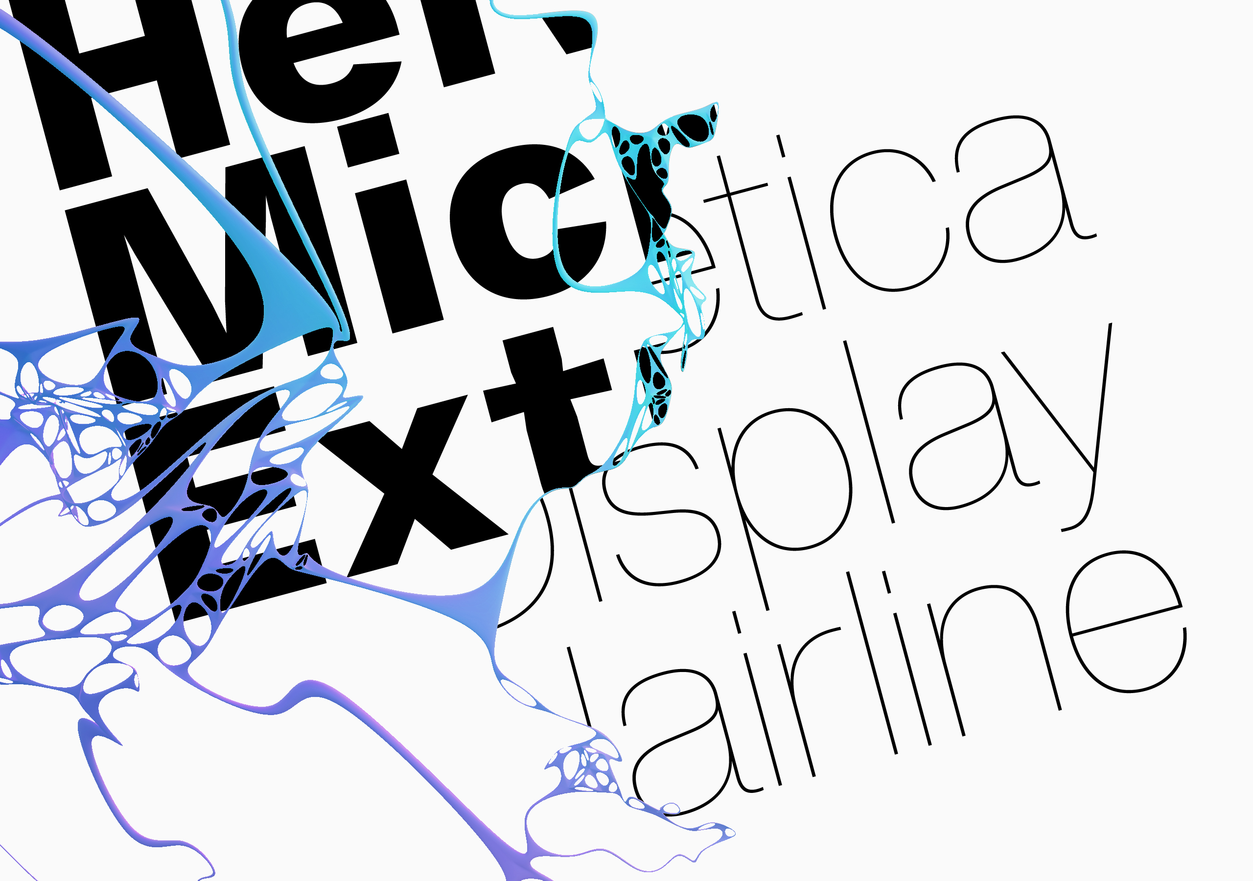
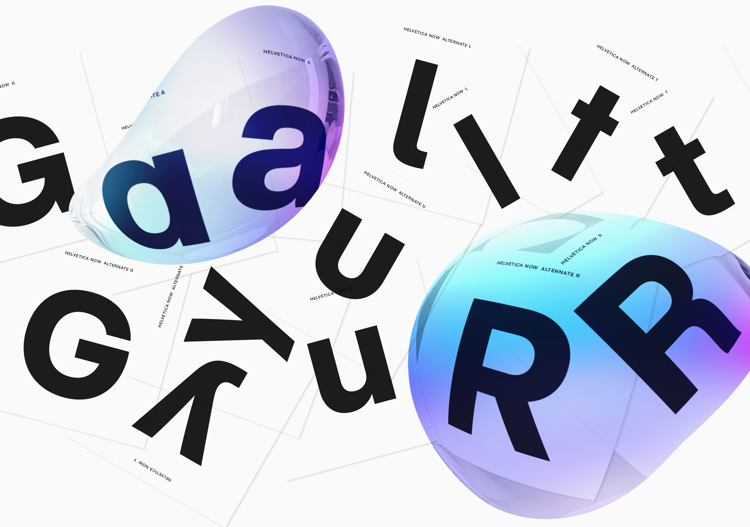
Years ago Spiekermann and others saw a need for a more robust Helvetica and now (finally!) we have that update. The family of 48 fonts has had every glyph redrawn to function during a time when designers have to solve problems on low-res and high-res devices, big screens and small screens, printed works and e-ink, and all the way up to large-format paper and pixel-based displays. Helvetica Now promises to be the Helvetica for every design situation. One specific situation is small, teeny, tiny sizes. The Micro iteration works in those domains and compared to older iterations, Micro promises to work exceptionally well at sizes of 7 point or smaller. Micro also works well in low-resolution situations, be it older and coarser computer screens, or print environments where paper might not hold ink well.
The New New
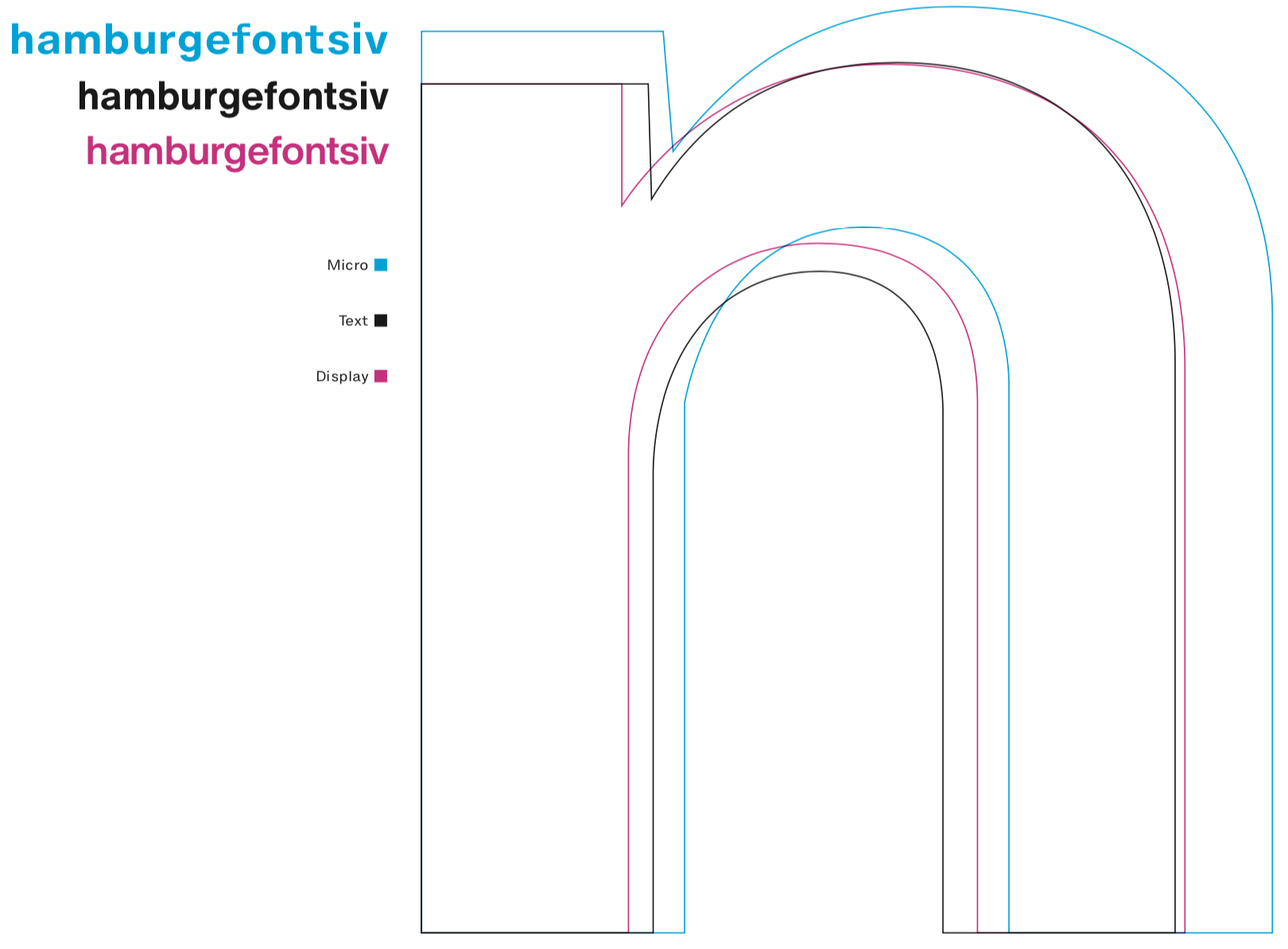
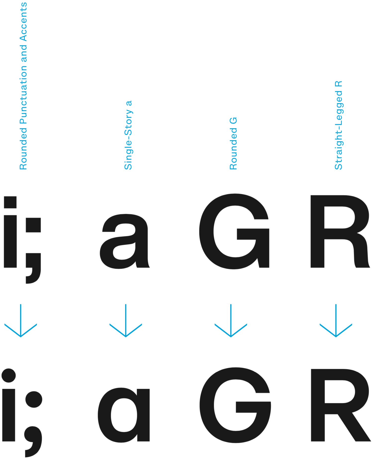
If you want variety, the update has that too. Chris Do, designer and founder of The Futur, says that Helvetica Now’s alternate characters are its most exciting component. “It’s like discovering an Easter egg each time I find one.” Options exist for glyphs such as the upper case R, as well as the lowercase i whose alternate has a round dot. Do calls these and other niceties “a breath of fresh air.” The update looks and feels familiar, but the way Do sees it, as soon as you recognize the enhancements, you’ll want to “smash buy now.”
Designers have complained about Helvetica’s shortcomings, and Monotype has certainly delivered with their latest update. “It takes a village to remake Helvetica Now,” said Charles Nix, type director at Monotype, who worked with his team on the project. In all, it took eight designers, including Terrance Weinzierl who created the Kairos typeface and Tom Rickner who’s championed variable fonts. The end result? A Helvetica that has what Nix calls better shapes and better features, as well as new glyphs. By all accounts, Helvetica Now is the best Helvetica right now, a welcome and much-needed redesign.
To Boldly Go Where No One’s Gone Before
Since Gary Hustwit’s Helvetica documentary debuted at the Dallas International Film Festival in March 2007, we’ve seen plenty of technological advancements, so a follow-up to the font seems appropriate. One has to wonder, is recent update enough to convince Hustwit to make a follow-up to his documentary?
“I don’t think it warrants a sequel,” he told me, “but I do think it’s interesting how type continues to change as the technology changes. When my film came out in 2007, the iPhone hadn’t even been released, we weren’t really reading a lot of type on smart phones back then. So I think it makes perfect sense to continually adapt type designs for new media as they emerge.” With newer technology forever looming on the horizon, in one possible future maybe we’ll get Helvetica Beyond. Until then, we have Helvetica Now.
Images courtesy of Monotype.