


Adam Ladd has worked in branding, art direction, and magazine layout, and along the way, he happened to see and use type—a lot. Having been the art director and designer for both HOW and Print magazines, you’ve probably seen his work, especially if you were a regular reader of those two publications.
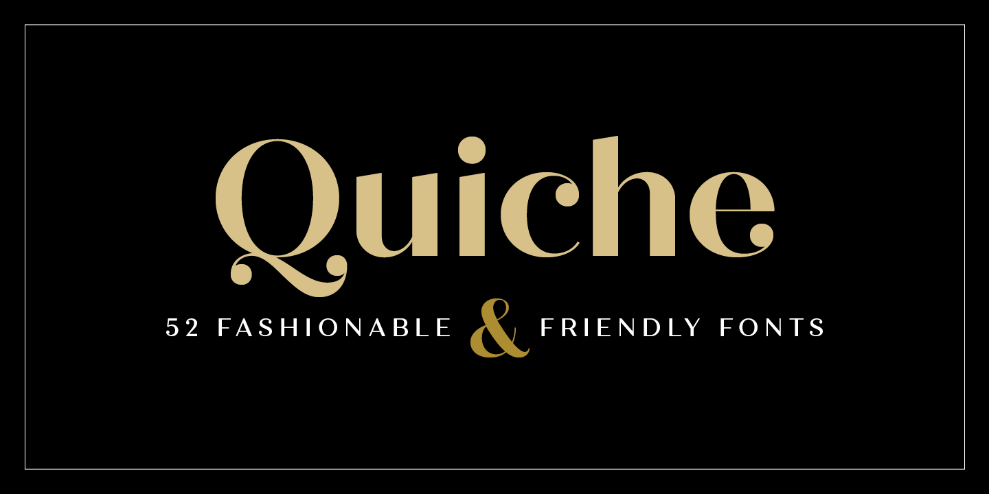
The Quiche typeface by Adam Ladd
After working for F+W and designing for HOW and Print, among other magazines, Ladd struck out on his own in late spring 2017. He became a type designer full-time. He has been interested in type since becoming a designer in 2003, and in 2013 he began to experiment with type design as a hobby. By 2016 he was putting more time into his craft. He’s become a prolific type designer, with fonts available at MyFonts, Fontspring, and Creative Market.
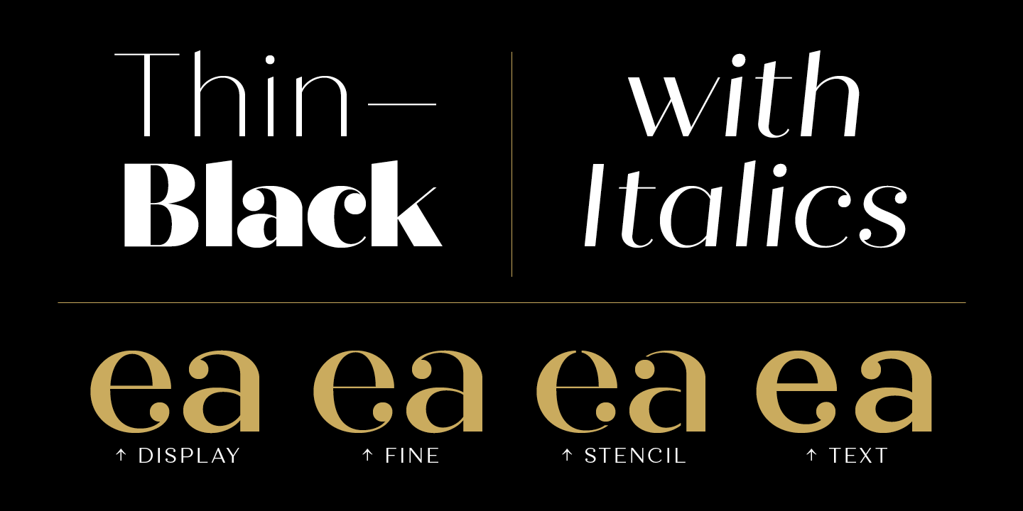
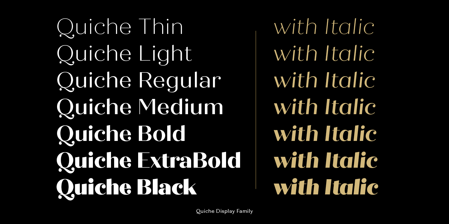
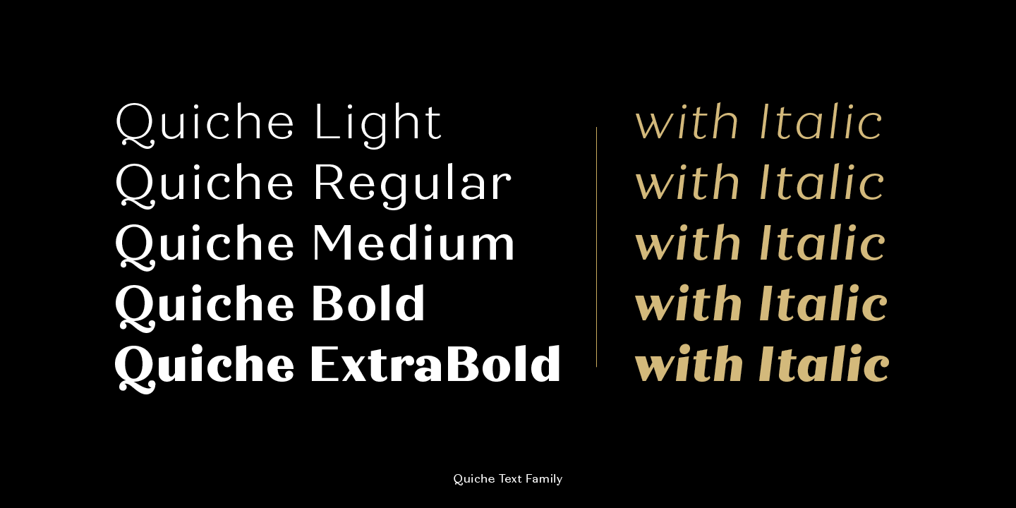
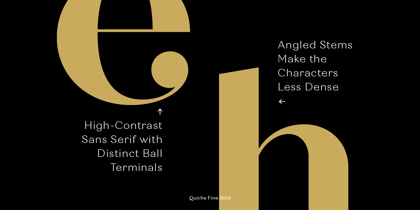
More Quiche!
Moving from a type design enthusiast to a full-time type designer took time and dedication, and most of all, an attention to detail. Fresh off making the HOW 100, Ladd shares his thoughts about type and the ability to tell stories with type.
Q: How long were you with F+W, working on HOW and Print, and what other publications did you design?
Adam: I was with F+W for a little over four years. During that time, I art directed and/or designed HOW magazine, Print magazine, and Horticulture magazine. I was an art director, and the role involved magazine layout as well as typical design duties for the magazines and brand support.
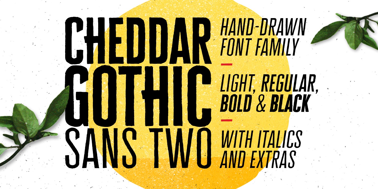
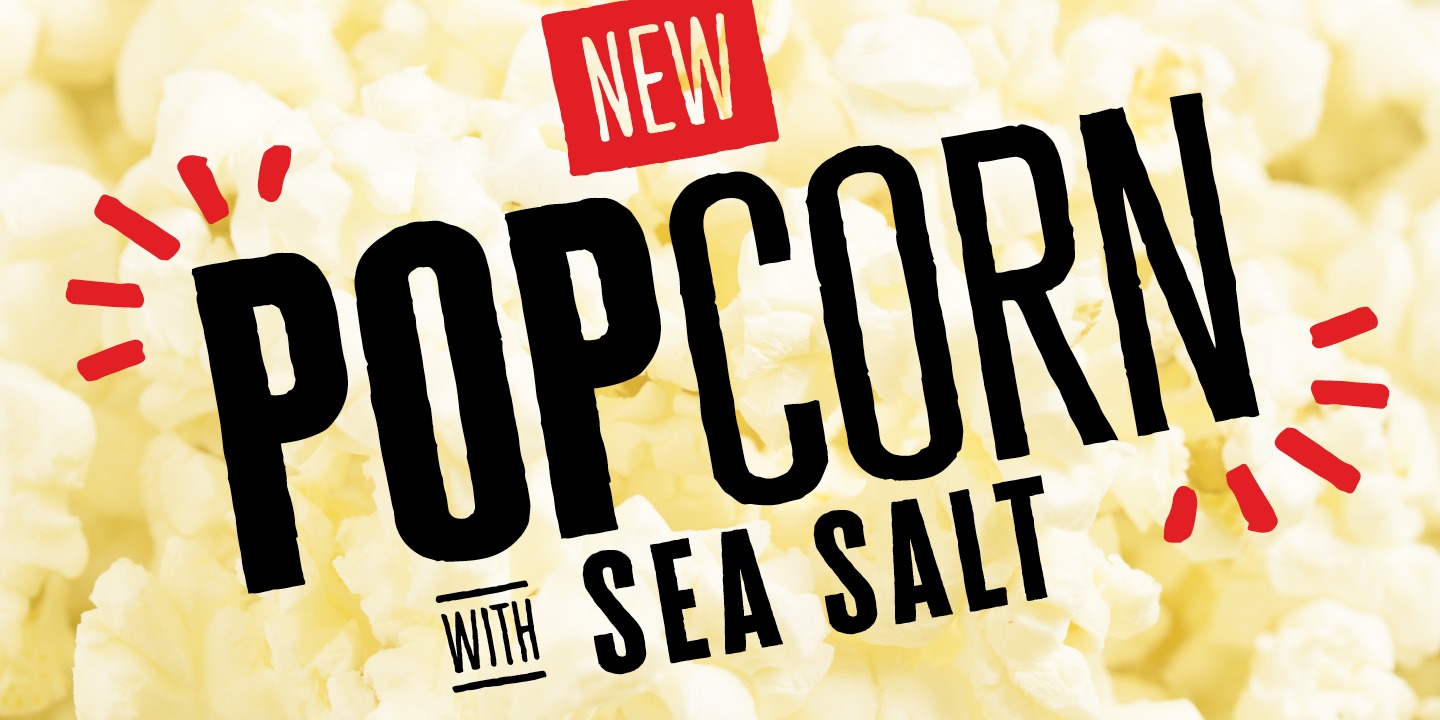
Ladd’s Cheddar Gothic typeface is as friendly as it is versatile, and can add something savory to any design you’re working on.
Q: How did your experience designing magazines shape your interest in typography and type design?
Adam: Because F+W does publishing and media, I was dealing with a lot of text all day long. So, I was saturated with type. And because I was designing magazines, it was a mix of working out longer type settings in the body copy along with short, impactful type settings in headlines (and then everything in-between with decks, subheads, captions, etc.). It helped me to recognize more of what kinds of typefaces and type treatments work for those different needs and how to design with them and for them. At HOW Design Live, it was a neat experience because I could get out from my normal routine and see what respected peers and leaders in the design industry were doing with their work and with type.
Q: Looking at all of your type design work, it’s evident that there’s a common theme present in each typeface. When we spoke about this, you mentioned wanting to tell a story with each font. What’s one typeface where you had that theme in mind from the start, and how did having that focus from beginning to end help with the creative and problem-solving process?
Adam: Some of the typefaces and their marketing have a stronger “story” than others. My aim is to at least feel focused in the marketing—meaning there is some relationship between the name of the typeface and the posters that give examples of how it could be used—rather than a typeface that has a random name that doesn’t fit its overall look and function, or posters that are so scattered and different that you can’t get a good sense of why the typeface was created or the best market it will serve. I usually have a temporary working name, and then after the typeface is complete, I explore options for a final name (because I’ve found the design can change or evolve from the first intentions for it).
 The Neato Serif typeface earned its name because, well… you guessed it, it’s neato.
An example of one typeface that started off with a pretty strong focus was Neato Serif. From the early sketches, I knew I wanted some of the defining features to be quirky ligatures (e.g. the ri and gi) and swashes, and that it would have a slight retro feel. I didn’t know the name I would end up with, but I figured something kind of playful would be fitting. Keeping those things in mind helped me stay more focused throughout and keep it all somewhat casual, which was part of the intent from the beginning.
Need more Neato Serif? Get yourself some Neato Serif Rough.
Q: There’s a massive amount of work that goes into typeface design, including but not limited to designing each and every glyph, and the branding of the typeface itself to help sell it. You call some of this work, especially at the glyph design level, “tedious practice.” What are some examples of tedious practice, and how have you improved over time?
Adam: After you finish drawing the characters, then it’s on to spacing and kerning the whole font—which includes combinations you don’t normally think about or use, not just the basic Latin characters (and if you have multiple, interpolated weights, then you may be doing some spacing and kerning twice for both the extreme weights you’ve drawn). This takes quite a lot of time and paying close attention (fortunately you can create kerning groups for characters that have similar shapes, so this saves time). You start to get more efficient at it and know what to look for as time goes along, but it’s still tedious. After it’s all finished, then there’s the next stage of creating the posters and marketing and preparing those things in different formats/sizes for wherever you’re selling it. Learning more about spacing has helped me think about the reading experience and when type is too loose or tight.
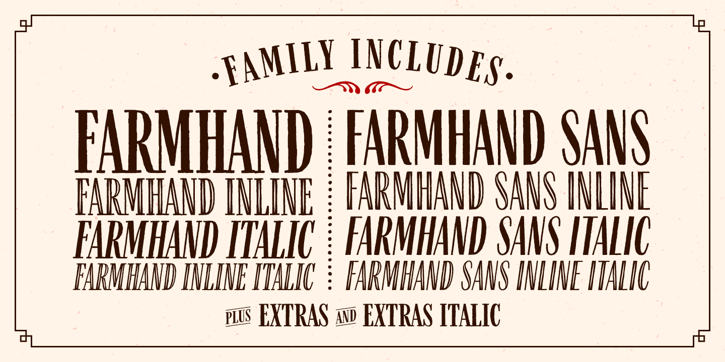
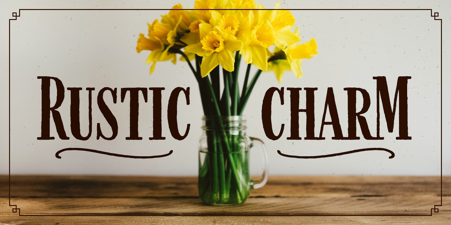
Ladd’s Farmhand typeface looks and feels rustic, and is appropriate for branding, packaging, and anything else that comes to mind—farms and barns are not necessarily required.
Q: You have to constantly be learning, and as an independent type designer, that learning happens in a vacuum. Without the company of other creatives, what are some of the biggest challenges you face and how do you overcome them?
Adam: The financial “risk” factor can come into play as a challenge. Because I don’t have the typical steady paycheck of income each month, I have to trust that the time I’m spending working is going to be fruitful. I sell in different shops where I receive income each month, but it’s not the same amount—sometimes it’s more, sometimes less, but there has started to be some averages that have shown up. It’s a balance of how to price the fonts and how often do I need to release new ones to keep the income on track. So, if I’m working on a new typeface that takes longer than usual, I have to keep the anxiety in check that I haven’t put anything new into the market in a while, and that the time I’m investing will be worth it. Of course, some sell better than others, and the ones that don’t quite net what I hoped, I try to learn from. I’m still learning all this, but I have faith, and we’ve been blessed.
One of Ladd’s typeface designs that’s a work in progress.
Q: Being on your own and also needing input, what resources have you used in order to get feedback about your own fonts, and how has that helped shape your own creative decisions?
Adam: It is tricky being on my own because it’s harder to get feedback on my works-in-progress. But there has been a great community of support who are willing to share their thoughts when I reach out. I have asked former co-workers and friends for their feedback, or at least sent them what I’m working on to get some initial reactions. That helps. My wife and daughters have been helpful in this as well, as I can get reactions and bounce ideas around with them. The type community has been great and very supportive—places like TypeDrawers or the Glyphs Forum. I’ve been able to ask technical and business questions and have received insights from very accomplished, experienced people. I’d also like to recognize Ryan Martinson of Yellow Design Studio and Laura Worthington, as they took a lot of time sharing their knowledge and experience with me when I began investing more into the type business.
Q: Who or what inspires you to be a type designer, to keep making type each and every day?
Adam: Part of what I like is how much work a good typeface (and typographic design) can do on its own. For me, I feel like whenever I have a quality typeface (or quality photo for that matter) to use for a layout or brand design, it makes things that much easier because I can play up those elements and let them get attention versus trying to over-design or add too much. So, I like to think that the typefaces I create can be used by others and fit a need they have. That it actually adds value to what they’re doing. The more time I’ve spent studying this field, the more I appreciate the people that have gone before in the past, and all that they did to create quality type and the guiding principles they laid out.
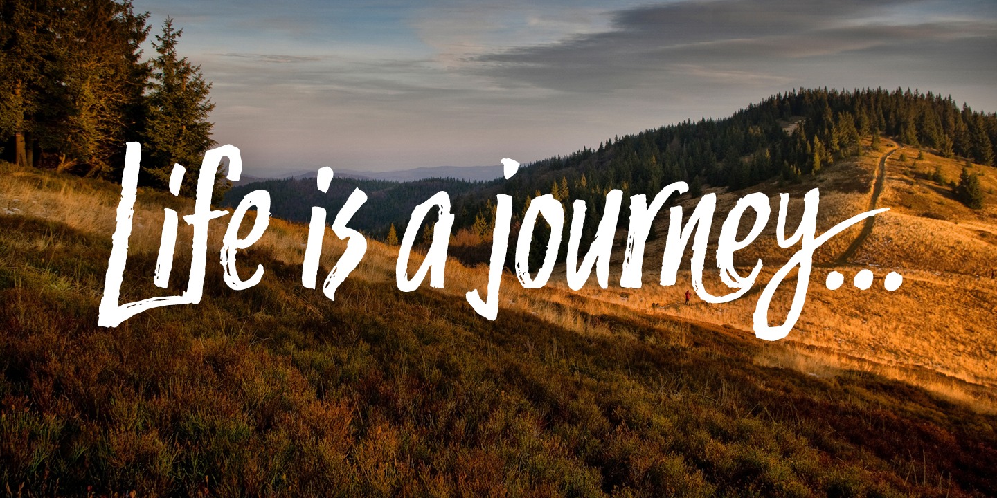
The handcrafted qualities of Trailmade can be seen in the visible brush strokes, making it suitable for designs and layouts that require a human touch.
Q: How would you react if you heard that you are an inspiration to designers, and what would you say to those people who look up to you?
Adam: I entered the professional design field in 2003, and like most everyone else, there’s a lot I’ve had to learn and a lot to still learn (especially given the shift from doing full-time graphic design to full-time type design). There’s been hard lessons through experience and time, along with leaning on the talents I’ve been given. All of this I’m grateful for. So to hear that I’d possibly be an inspiration is humbling and an honor because I can relate to everyone else who’s searching things out and learning along the way. But I’m very glad that my experience so far could potentially help or encourage other designers. To others, I would say to try to identify where your strengths and interests really are and keep pushing those things further in the midst of your normal day-to-day. It may require extra time and effort but with small steps, taking action, faith, and patience, things can begin to blossom.
Learn more about Adam’s typefaces at his website, and for type design announcements, sign up for his newsletter. You can also follow Adam on Twitter where he routinely posts about his fonts.
Edited from a series of electronic interviews.