


In this helpful tutorial, Nikita Prokhorov teaches us how to make an ambigram of the word “online.”
I am blessed to have been raised by a family of artistic people. My grandfather was an architect and a painter. My mother and grandmother, despite making their careers as psychiatrists, loved art and could teach any college level art history class without a textbook. Naturally, rather than become a doctor, I turned to art and graphic design. Whether it is the influence of my grandfather or my Freudian mother and grandmother, my taste in art and design has always been unusual in the sense that I am drawn (pun intended!) to art that pulls you in for a second, third, fourth… or even an infinite number of looks: a good example would be Rene Magritte and M.C. Escher.
Ambigrams are words that, when viewed from a different perspective (rotated, mirrored, reflected, etc.) read as either the same or a different word.


Ambigrams from Nikita Prokhorov’s site, ambigrammist.com
I first noticed them on the pages of the book Angels & Demons by Dan Brown, and they immediately drew me in much like the art of Magritte and Escher. A well-designed ambigram has an imperceptible duality which is not immediately obvious to the naked eye. The artistic epiphany that occurs, once you realize a word can be rotated and you can still read it as a word (whether it’s the same as or different from the original), is absolutely beautiful.
So, how does one go about creating an ambigram? Just like any artistic endeavor, it takes time and practice. To become a painter, you have to paint, and paint often. If you want to be a hand-letterer, start drawing letters by hand every day. And if you want to learn how to design ambigrams, start sketching. And sketch a lot. Aside from sketching, there are several good rules to follow, though these are not chiseled in stone.
Creative foundations
It is challenging for anyone learning how to make an ambigram, but it’s even more challenging for someone who doesn’t have a basic design education and understanding of typography. At its core, ambigram design is typographic manipulation, with a few teaspoons of graphic design and art thrown in. However, to be able to manipulate the letters successfully, you need to know the rules and principles of traditional typography.
That said, you don’t have to be a graphic designer to learn how to design ambigrams: two of my friends, one of whom is an engineer and the other is a fossil collections manager, draw some of the most beautiful ambigrams I’ve ever seen.
Simplicity
When branching out into a new artistic direction, simplicity is the word du jour. Michelangelo didn’t paint the Sistine Chapel the first day he picked up a paintbrush, much like you shouldn’t start with a very complex word for your first ambigram.
Let’s take the word “online” and create an ambigram from it. There are many different types of ambigrams, but we’ll focus on a more traditional 180 degree rotational ambigram: this simply means that you have to rotate the word 180 degrees to see the second word.
Step by Step: How to Make an Ambigram
Step 1 – Write the word down
Pretty simple, no? Grab a pencil (you’ll be doing a lot of erasing, so a pencil is a great idea) and write down the word you’ve chosen twice: once the way you would normally read it, and once upside down, directly underneath the first word. Try it in both lowercase and uppercase!
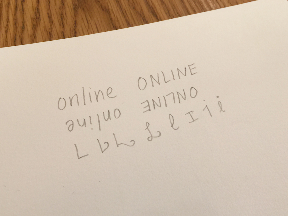
Your selected word written out several different ways
This process is important because it allows your eyes and brain to
A) get used to seeing traditional letters upside down, and
B) see how the upside down letters relate in overall shape to the first word.
This helps establish visual connections between letters and pick up on certain typographic details that you may not see without flipping the letters upside down. You may not realize that if you flip a ‘b’ upside down, you’ll get a ‘q,’ and if you mirror the ‘q’ vertically, you get a ‘p.’ It’s all a matter seeing something you’re used to from a different perspective.
[Related: 10 Indispensable Typography Terms, Illustrated | Theo Rosendorf, Type Fanatic: On the Importance of Typography in Design | 3D Design Geekery: A Movable Book of Typography Design]
Step 2 – Letter ratios and analysis
In ambigram design, there are several possible letter ratios that you can encounter.
1-to-1 flip – This is the ideal case scenario, where one letter turns into another letter when rotated. Once rotated, it could be the same or different letter from the original.
2-to-1 flip – This is a slightly more complex letter ratio, where two letters morph into one letter when rotated.
3-to-1 flip – This is probably the most difficult letter ratio, when three letters become one letter when rotated.
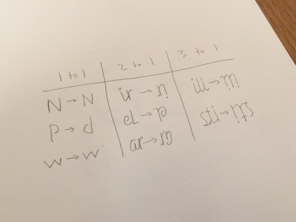
Examples of the above flips. Note that these flips are not part of the word chosen for this article.
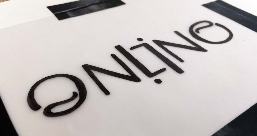
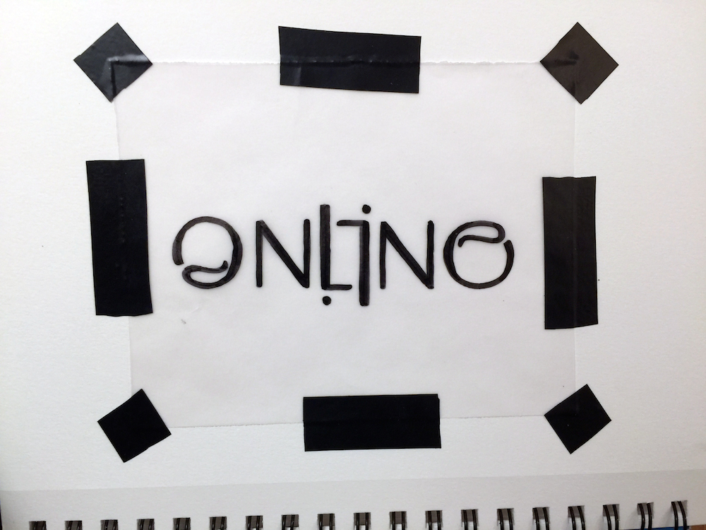
Now let’s look at the letterforms of the word “online.” This step helps you analyze the word to see what type of letter combinations/pairings you’ll need to develop. You can either establish a center point in the word and analyze from the inside out, or start from the outer letters and work towards the center of the word. For this word, seeing as there are two circular elements at the end and the beginning of the word (o, e) and several very strong verticals (n, l, i), it didn’t make much of a difference which approach I used. But let it be known that I started with the ‘o’ and ‘e’!
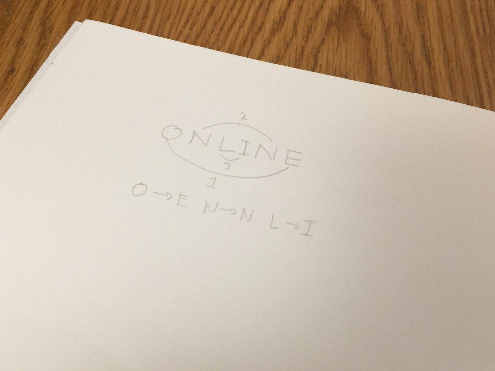
“Online” with analysis
Since this is not a very complex word, we already see potentially fruitful typographic relationships. The ‘o’ and the ‘e’ have a very similar structure, and you’ll need to make minimal adjustments to make them legible. So your first letter paring is a 1-to-1 ‘o/e’ flip. The ‘n’ turns into an ‘n’ upside down without much effort: your second pairing is an easy 1-to-1 ‘n/n’ flip. That leaves the ‘l’ and ‘i’: both letters have strong verticals, and your last flip will end up being a 1-to-1 ‘l/i’ flip. Now that the letter pairings have been determined, it’s time to sketch.
Step 3 – Sketching
A good rule of thumb is to start your ambigram design with simple monoweight lines. Why? Well, it’s similar to logo design, where you make sure your logo works well in black & white before you start adding colors and other elements. In ambigram design, starting off with letterforms that have a lot of contrasting thick/thin elements, and have a more complex structure (blackletter typefaces come to mind) can be detrimental to the functionality and readability of your ambigram. Start with simple monoweight lines, and make sure your ambigram is legible and readable before introducing any specific typographic styles.
Remember the old Bauhaus School motto – “form follows function.” Keep it in mind when working on your ambigram!
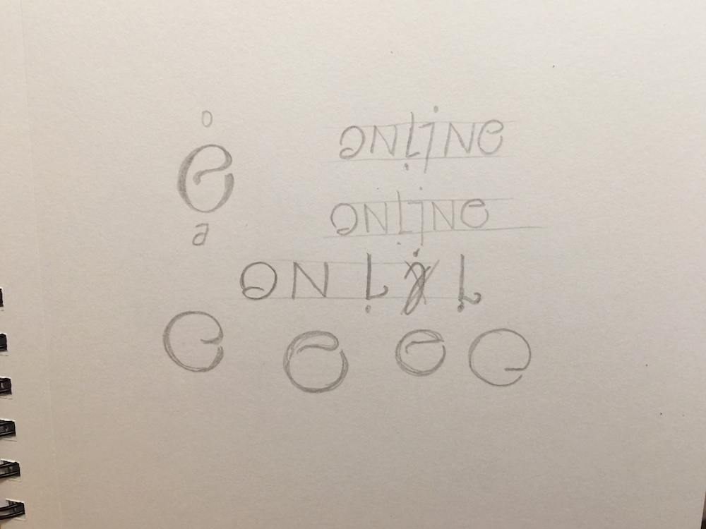
sketches for the “online” ambigram
Step 4 – Refinement
Once your ambigram is full legible and readable, time to add some meat to those typographic bones. At this point it’s a matter of which typographic style you prefer. However, keep in mind that not every typographic style will work with your ambigram: the ambigram design drives the style, not the other way around. Some styles will work, some won’t—it’s simply a matter of experimentation.
At this point, you may be wondering whether to stay on paper or switch to the computer. It’s a matter of preference! Personally, I love drawing ambigrams and letters on both paper and computer, but the medium is driven by the end result and need. However, another rule of thumb applies here: before switching to the computer, make sure your ambigram sketch is as refined as possible. No amount of software knowledge will make up for a half-hearted sketch and an illegible ambigram—it will actually do more harm than good, while causing you unnecessary frustration.
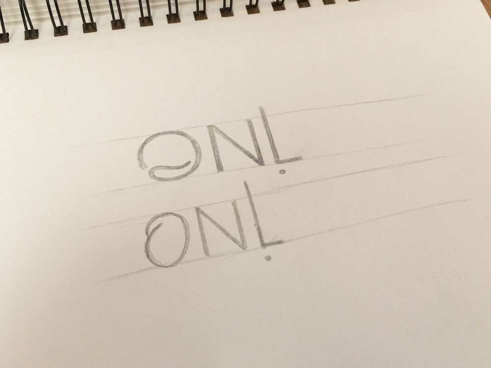
Hand-drawn ambigrams. Only halves are drawn because this word is a perfect split down the center, and you only need to draw one half and rotate it 180 degrees to complete the ambigram.
So, there you have it—your first ambigram! Despite using a simple word, there are still some challenges that needed to be tackled in order to make this word a successful ambigram: the legibility of o/e flip was the toughest problem to solve for this word. With a more complex word, you’ll end up with many more sketches and headaches, but the same basic theories apply to “online” as they would to “supercalifragilisticexpialidocious.”
Keep on ambigramming!
Next: Tackle a new lettering skill in Xandra Zamora’s online brush lettering course from HOW Design University.