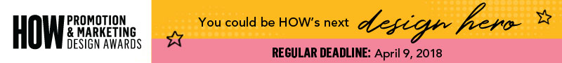
Daniela Garza of Anagrama, Joshua Chen of Chen Design Associates, and Mackey Saturday of Chermayeff & Geismar & Haviv await your work in the HOW Promotion & Marketing Design Awards.
Deadline to enter: 11:59 EDT TONIGHT, April 9
Parisian designers Violaine Orsoni and Jérémy Schneider met in 2010 while working at the ad agency Les Gros Mots. It didn’t take long for them to fall in love and head out into an orbit all their own, quickly establishing their studio Violaine et Jérémy as a bright star shining in Paris’ design constellation. The designers create publications, type, identities, illustrations and exhibitions infused with a playful, modern sensibility for clients including Bottega Veneta, Tiffany & Co., Nike and Institut National Des Métiers D’art. All of their work sparkles with an irresistibly charming mix of classicism, humor and refined typography.
Jérémy’s finely detailed illustrations, influenced by the style of Caravaggio and Ingres, lend gravitas and a sense of history to their projects. He holds a Master’s degree in graphic and digital design from the École Professionnelle Supérieure d’Arts graphiques et d’Architecture de la Ville de Paris (EPSAA) and serves as the studio’s resident designer, illustrator and typographer/type designer. Violaine, who attended advertising/communication school and was head of production at advertising agencies (including the one where they met), handles the creative direction. Together, they are formidable.
Q: Jérémy, your interest in art history is clear to see in your illustrations. But the studio’s overall design work doesn’t look retro or historic. What’s the trick to keeping it modern?
Jérémy: We say we have a timeless aesthetic, and try to produce work in a traditional way with a modern twist.
Violaine: Jérémy always tries to find a subject that will take his line work out of the classical world by lifting it out of time and giving it a modern framework.
Q: Do you draw by hand?
J: Oh, yes. If you could see our studio! We have pencils all over. Tons of pencils, all sizes. Some so small they’re almost gone. We add color digitally, though, it’s much easier for last-minute changes.
Q: The work you did for Big Fernand Burgers is wonderful; it has so many lighthearted aspects: the rubber stamp, the stickers, the newspaper. You even designed a font for them. Can you describe your process? Were they a new client?
V: We won a competition to work on their new identity, and the thing with this brand is they always had a very nice sense of humor. We had so much fun doing this! In everything we made for them, you can always see jokes or something funny. We proposed so many different mediums and formats, and they were OK with everything!
Q: When Jérémy draws a custom font for a client, do you license the typeface for general use later?
J: No, it’s for a single use. In our first project, the client didn’t ask for a custom typeface, but since we love to design type, we did it. Now we pretty much design type for all our clients.
V: In general, no one asks for custom typefaces but Jérémy just does them as a surprise, like a present for the client. They always fall in love with the type because they never expected it in the first place.
J: We recently decided to license our fonts, and are preparing a website for our new type foundry. It was supposed to launch in October 2017, but better to be right than on time! When you make a typeface for a client, it doesn’t have to be complete. You don’t always have to work out all the glyphs and language support. But if you sell it, it has to be perfect.
V: For the foundry, we selected 10 of our typefaces and tried to make them really perfect. A friend told us: In typography we say you never finish a typeface, you just abandon it. You just give up with the last rounds of reworking and you go for it and it exists with its little errors, that nobody sees except you and maybe one other person in the whole world.
Q: What are you working on right now that you’re excited about?
V: We are collaborating with the street photographer JR, a very well known French photographer who is a friend of David Blaine, the magician. We are working with them to produce a deck of cards. When you lay out the cards side by side, they create a single huge drawing with many references to JR’s and Blaine’s life and surroundings. We’re also working on a big historic exhibition about Napoleon at Les Invalides in Paris. We did all the artistic direction and communication design for the exhibit.
Q: How did you know that you would be a good partnership professionally as well as personally?
V: We share the same taste, so the design process is very natural and easy. We match, and that’s it. And as good French people, we take a lot of holidays. You live just once. I don’t understand people who don’t take holidays. People don’t allow themselves to enjoy their lives. Also, I am very in love with him! And because our relationship is so nice, it reflects in the work.
Q: Sounds like you’ve figured out all the secrets to a happy life!
J: We forgot to say one thing. CHEESE! Violaine also loves it, a little, but I am really focused on it.
V: It is the word to end our talk! Cheese.