


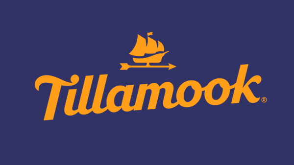
The focus groups were muddled on Tillamook Dairy’s choice of using a classic ship as part of the Oregon-based company’s new branding effort. That Morning Star ship, built in the early years of the farmer-owned co-op as a way to deliver dairy products to market, was on the design chopping block. Consumer testing showed people said random things about the ship and couldn’t wrap their heads around it.
“That is the reason we should keep the ship,” says Audrey Crespo, Tillamook creative director. “It was causing people to stop and wonder. It is quirky, but very ownable to us. That is an asset that nobody can replicate.”

Tillamook Dairy is on the Move
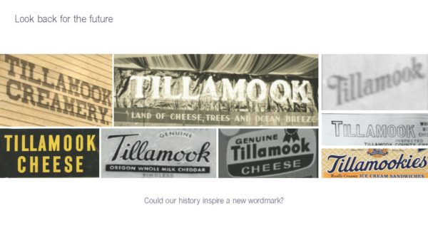
From that ship to a new main logo (a Tillamook wordmark hand-drawn by a typographer), the 110-year-old Tillamook took cues for its new look from its history. With new branding, new color use, and new creative packaging, Tillamook is taking this fresh approach beyond the West Coast, moving national and international.
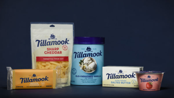
Tillamook has grown more than 60 percent in the last five years, a period where the dairy industry has only grown 1.5 percent annually. This massive growth has meant that Tillamook added more products in the last four years than the preceding 40. It also means the Tillamook name — not easily pronounceable for folks who aren’t familiar with it — is a new one to many in an intensely crowded and competitive dairy aisle.
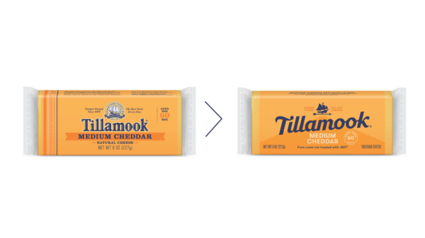
“The older packaging was getting inconsistent and there was no common tether for the consumer, especially a new consumer when in different parts of the grocery store,” Crespo says. “We knew we needed to create more consistency so when a consumer in North Carolina happened to pick us up on the cheese aisle, they could see us in ice cream.”
It’s All in the Name
The first order of business in the design was playing up the Tillamook name. While other dairy brands diminish the brand in lieu of product type, Crespo says being a beloved brand with a large following known for quality meant embracing the brand name. But she also knew they needed to show up more modern, more bold, and definitely more friendly.
“Our old packaging was really old-fashioned, dairy done same,” she says. “It was all cream. How do we jump out from the shelf and just be different?”
The Tillamook mark, then, takes that look. Crespo managed the project and hired Turner Duckworth out of San Francisco to help (the number of SKUs that needed redesigning was daunting). The firm presented three different concepts for the main logo, but Tillamook wanted that mark to be more more distinct.
Turner Duckworth hired a typographer, who came up with a way of having the point of the T be the dot of the I and other “little things that would make it more ownable, like the quirky little k, as we do have some quirkiness as a brand.”
The final hand-drawn design, inspired by a logo from the 1950s, offers a slant for boldness, a heritage wink and plenty of friendliness without looking old-fashioned, erasing Tillamook’s traditional lettering.
Color as Code
Then came color. “We decided to go really strong with color as a differentiator,” Crespo says. “Not only to stand out more on the dairy shelf, but to help the consumer find their favorite flavor.” Now each flavor has its own base color to stand out from the creams often associated with dairy and allow product photography to shine — have a look at that marionberry ice cream.
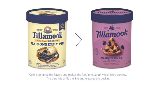
The primary colors remain the Tillamook blue and orange. The orange serves as a heritage color for the brand, but the blue comes relatively newer as it was often an accent to red historically. Now, though, blue acts as a unifying element for all the packaging and also stands as the corporate color in a world full of white, cream and cows. “The blue plays well when we get colorful,” Crespo says. “That is a very important part. We have to show up in a consistent way, but throw in color to enhance communication.”
With every single product — whether yogurt, cheese, sour cream, ice cream, or butter — needing to stand out in its own uniquely competitive area, consistency through mark and color helps Tillamook connect with the consumer. And that’s why the Tillamook logo plays so strong.
Wind at Tillamook’s Sails
The ship has already turned into the star of the redesign. While using the ship and wordmark logo together whenever possible at first, Tillamook has already started to use the ship on its own. Signifying the grit and ingenuity of the farmer-owned company and its history, the ship moves out of an old-fashioned busy, round logo and stands alone. “It is the symbol of the farmer,” Cresp says. “I feel like it is already picking up strength.”
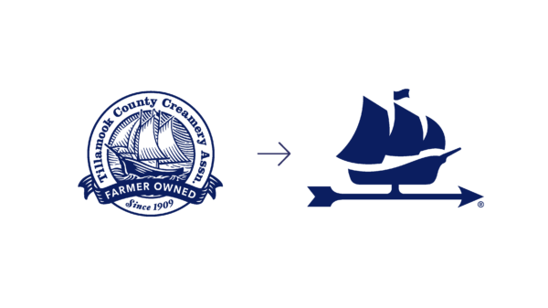
Tillamook has set the ship atop a weather vane to help add another farmer-friendly activation that combines the brand’s coastal origins with farming roots. A barn shape on all products blends early design concepts into one final brand. Plus, the barn element used subtly behind the ship/weather vane and Tillamook logo help provide depth to the packaging, Crespo says, while adding another tether across products with a tie to farmers.
Add in the fact that the ship faces east, the direction of Tillamook expansion, and not only has Tillamook created a new look for a historic brand, but they’ve created a new aesthetic for the dairy aisle all across the country.
Follow Tim Newcomb on Twitter at @tdnewcomb.