


Legibility holds an important place in design. Maximum legibility, though, can prove a designer’s art form worthy of achievement. Answering the question — What is typesetting? — can help a designer get there, says Charles Nix, type director at Monotype.
“Typesetting is the careful arrangement of text in a typeface in order to achieve maximum legibility,” he says. “It involves type facing and setting type, but it also involves massaging that typesetting matter to give it maximum legibility and aesthetic appeal.”
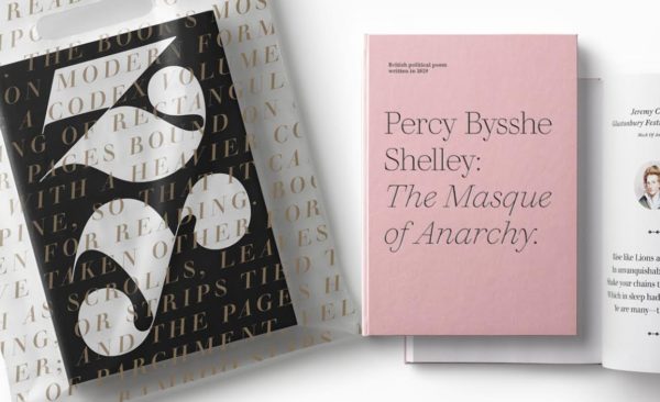
Typesetting in editorial offers a mixture of use cases. Courtesy Monotype
Readable vs Legible
Just as there offers a gaping difference between throwing words together on a piece of paper and the craft of writing, Nix says typing something and typesetting couldn’t be further from each other. “In one, there is a craft to it and all the things that go along with it and the steps. There is a difference between creating text that is readable that someone can comprehend and creating text that is legible, that is conducive to being understood. It is subtle, but it is important.”
That subtle difference between readability and legibility is important in the world of typesetting, Nix says. They can come through a host of small details. “Some are obvious, some not,” he says. “There are all sorts of cultural clues given off by type-set text.” From the choice of typeface to the “niceties of line length,” and from the quality of the font, the size it is used at, the condition of the design around it, the list goes on for what typesetting is about.
And it should matter to a designer.
A Professional Indicator
“Well typeset text makes the work of the young designer different than those who don’t care for it,” Nix says. “It is a key differentiator between non-professional work and professional work. That is a huge reason people embark on this quest to set type well simply to differentiate themselves from those who don’t know how to do it. Those who know can look at the work of others and judge it as wanting. Art directors and publishers and people who hire have a good sense of typography and typesetting. If you can’t impress them with your like-mindedness and ability to see type, they will dismiss you almost out of hand as someone almost insensitive to type.”
For Todd Radom, who started his career in book publishing before becoming arguably the leading sports graphic designer, typesetting “is, and has always been, one of the key foundational aspects of design.”

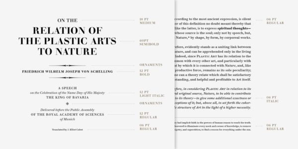
The Justus Erich Walbaum example offers a close-up look at properly typeset text. Courtesy Monotype
“In a pre-digital world, where we had to send out for type, it was expensive and the process was cumbersome, at best,” Radom says. “Today’s world is far more focused on the digital and mobiles experiences, of course, and sound typographic decisions are more necessary than ever in helping to communicate an effective message.”
No Faking It
Radom agrees with Nix: designers can’t deceive a lack of typesetting knowledge. “For me, solid typographic skills separate pretenders from contenders,” Radom says, “there’s really no faking it.”
Typesetting involves the craft of setting type, sure, but it also involves the art of setting type. Nix points to editorial design as the key home for the use of typesetting in graphic design. “In editorial, there are two areas where the ability to typeset well is imperative,” Nix says. The first: headlines. If you can’t set a headline well, you won’t be setting headlines at all. Then comes text, with some of the same areas of concern, but a new range of needs too. “The ability to see what makes good typeset text are imperative to your survival,” he says.
But the importance of typesetting reaches far beyond one medium of work. Any design that involves type requires that understanding of typesetting. It could be package design. Signage. Any world where the use of type attracts attention puts the onus on typesetting to do the job well.
“Whether you’re designing for print, apps, film or the web, good typesetting skills are key,” says Gail Anderson, creative director Visual Arts Press. “That’s never going to change, even as the ways we consume information continue to evolve.”
Optical sizing highlights the importance of proper typesetting when using different font sizes. Courtesy Monotype
Set a Strategy
In the process of selecting the best typesetting strategy for a project, Nix points out basic aspects. First comes the choice of type. Like pairing a wine with a meal, the ability to understand what typeface makes sense for a particular project sets the tone. Sometimes this comes dictated by formats, but mostly taste rules the show. Then comes size. You can’t go too big, but can’t go too small and you must understand the space between the lines. Sticking with the spacing theme, designers must understand kerning — the space between characters within the headlines — as well as word spacing. “It becomes super important to understand how to create consistent legible text by manipulating space between letters and words,” Nix says.
Then, to wrap up typesetting basics, comes an understanding of how words work. “You are not only caring for the way it looks,” Nix says, “but what it says. Are you aware of the author’s intent? Do you have editorial savvy?”
With typography about harmony and contrast and about finding and achieving balance, Radom says designers need to understand such questions as how do decorative letterforms balance with the need for legibility or how does scale play into a design or even how does type interact with images in order to form a complete and effective piece of design.
Todd Radom’s “Winning Ugly” book offered the designer a chance to typeset his own designs. Courtesy Todd Radom
Lost and Found
Anderson says she remembers a time when type was time consuming and costly. “I still have flashbacks where I’m squinting and slowly sliding letters apart to massage the spacing,” she says. “But there’s something to be said for having to make very deliberate choices about the type you used. That’s sometimes lost on students as they quickly scroll through whatever fonts are open on their machines.”
Gaining this knowledge of typesetting, this understanding of how to do it well requires a steady dose of observation and conversation, Nix says. Designers can learn from others.
Nix, a graduate of The Cooper Union, says his typesetting study was first driven by the people he knew professionally and at school. “I met people who really taught me how to see type,” he says. From an art and calligraphy instructor showing how to see abstract marks and the balance of space to an instructor who pushed knowledge on the history of typesetting.
History and Hovering
Understanding the history of typesetting led Nix to a body of literature surrounding typography and typesetting. “Reading any one book will lead you to 12 other books and you can learn and understand what is collectively important,” he says. “You can learn what things the people who write about the subject are at odds over and find your own way as a result. It is all about listening to other people and eventually making up your own mind.”
A third key instructor in Nix’s journey, the school’s design director, stood over Nix’s shoulder while he worked, helping him understand letter-space type. “We would work on a headline and he would say a little closer between the ‘t’ and the ‘a’ and a litter father apart around the capital ‘I,’” he says. “Sometimes I knew what he was saying and could predict and eventually I internalized the logic of it and it became part of my working method.”
What Is Typesetting, Really?
Slowing down and really looking at the relationships of letters to each other and thinking about how to organize information on a page or screen remains part of the process, Anderson says. “Good design is good communication,” she says, “and the head-of-a-pin considerations can be really intriguing to consider.”
As typesetting has evolved — the concepts of metal typesetting between the 1900 and 1950 changed drastically when it transformed to digital typesetting — in terms of function, the need for designers to understand the process hasn’t altered. Maximum legibility remains the goal. And typesetting can help designers get there.
Follow Tim Newcomb on Twitter at @tdnewcomb.
very knowledgeable. I have a problem. do I find a website font in chrome?